7 styles
Tester
Weights


Glyphs
Languages
Abenaki, Afaan Oromo, Afar, Afrikaans, Albanian, Alsatian, Amis, Anuta, Aragonese, Aranese, Arrernte, Arvanitic, Asturian, Aymara, Basque, Bikol, Bislama, Breton, Cape Verdean, Catalan, Cebuano, Chamorro, Chavacano, Chickasaw, Cofan, Corsican, Danish, Dawan, Delaware, Dholuo, Drehu, Dutch, English, Estonian, Faroese, Fijian, Filipino, Finnish, Folkspraak, French, Frisian, Friulian, Galician, Genoese, German, Gooniyandi, Greenlandic, Guadeloupean, Gwichin, Haitian Creole, Han, Hiligaynon, Hopi, Icelandic, Ido, Ilocano, Indonesian, Interglossa, Interlingua, Irish, Italian, Jamaican, Javanese, Jerriais, Kala Lagaw Ya, Kapampangan, Kaqchikel, Karakalpak, Kikongo, Kinyarwanda, Kiribati, Kirundi, Klingon, Latin, Latino Sine, Lojban, Lombard, Low Saxon, Luxembourgish, Makhuwa, Malay, Manx, Marquesan, Meriam Mir, Mohawk, Montagnais, Murrinhpatha, Nagamese Creole, Ndebele, Neapolitan, Ngiyambaa, Norwegian, Novial, Occidental, Occitan, Oshiwambo, Palauan, Papiamento, Piedmontese, Portuguese, Potawatomi, Qeqchi, Quechua, Rarotongan, Romansh, Rotokas, Sami Southern, Samoan, Sango, Saramaccan, Sardinian, Scottish Gaelic, Seri, Seychellois, Shawnee, Shona, Sicilian, Slovio, Somali, Sotho Northern, Sotho Southern, Spanish, Sranan, Sundanese, Swahili, Swazi, Swedish, Tagalog, Tetum, Tok Pisin, Tokelauan, Tshiluba, Tsonga, Tswana, Tumbuka, Tzotzil, Ukrainian, Uzbek, Venetian, Volapuk, Voro, Walloon, Waraywaray, Warlpiri, Wayuu, Wikmungkan, Wiradjuri, Xhosa, Yapese, Yindjibarndi, Zapotec, Zulu, Zuni
About Foundry Origin
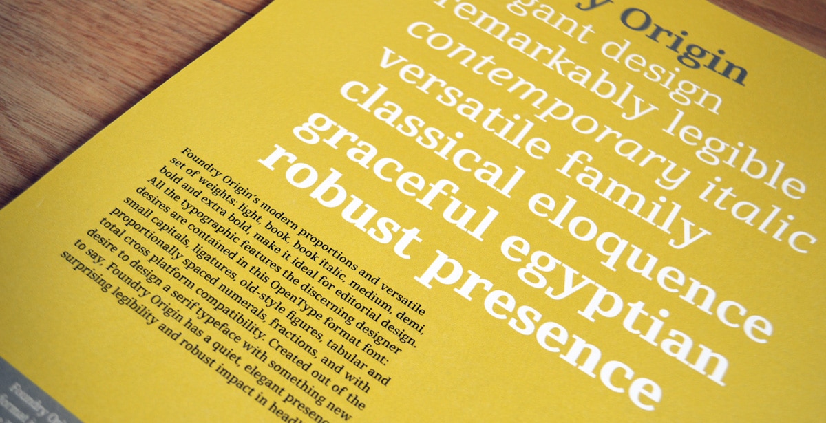
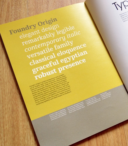
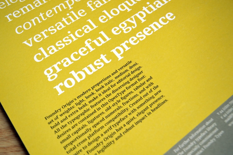
Foundry Origin, a robust but elegant, classical but contemporary slab serif typeface. Its elemental quality hints at its ‘Egyptian’ roots. With a generous x-height and modern proportions, it is essentially legible at small point sizes and versatile at larger sizes.
Created out of the desire to design a serif typeface with something new to say, Foundry Origin has a quiet, understated presence, surprising legibility, and robust impact in headlines. A strong, carefully considered, and dependable typeface.
Stuart de Rozario recalls his early mindset on the project, ‘I wanted to have a serif that worked equally well on screen and in print at very small sizes. In 2006–07, the screen quality for serif fonts was not as sharp as it is today and maybe a bit of a taboo subject. We never had the high-resolution Retina displays we have today, although screen technology was improving all the time, thin, delicate, hairline serif strokes had difficulty rendering adequately on screen, so I made the conscious decision to have a font that performed clearly’. Stuart continues ‘From the outset, the serifs needed to have a certain thickness and design that was modern, subtle and graded smoothly across the weights. As a text typeface, the letterform proportions demanded to be classic but modern and the serifs lent towards a strong horizontal dynamic to perform well in a variety of mediums’.
Foundry Origin’s modern proportions and versatile set of weights: Light, Book, Book Italic, Medium, Demi, Bold, and Extra Bold, make it ideal for use in editorial, signage, and information design. The character set contains small capitals, old-style, and tabular figures, and ligatures.
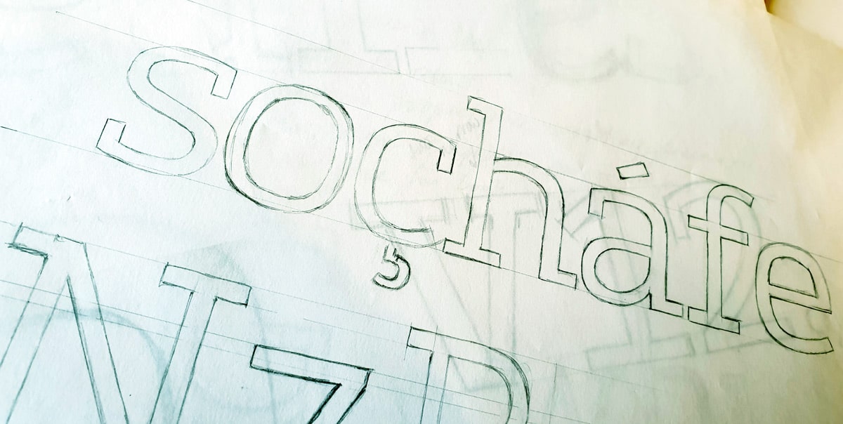
Foundry Origin ‘soçhafe’ rough sketch.
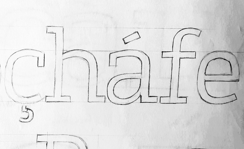
Foundry Origin ‘çhafe’ rough sketch.
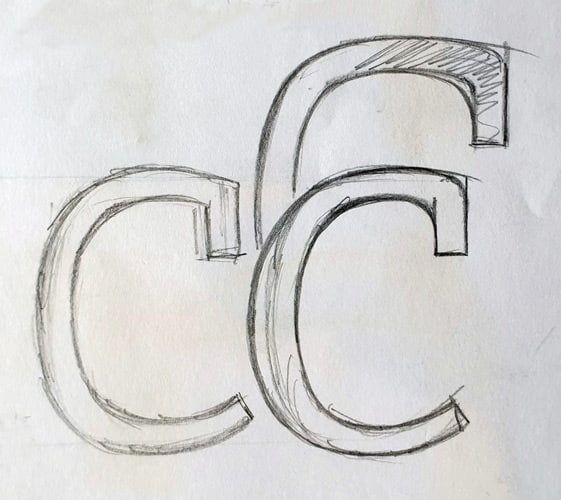
Foundry Origin ‘c’ terminal development sketch.
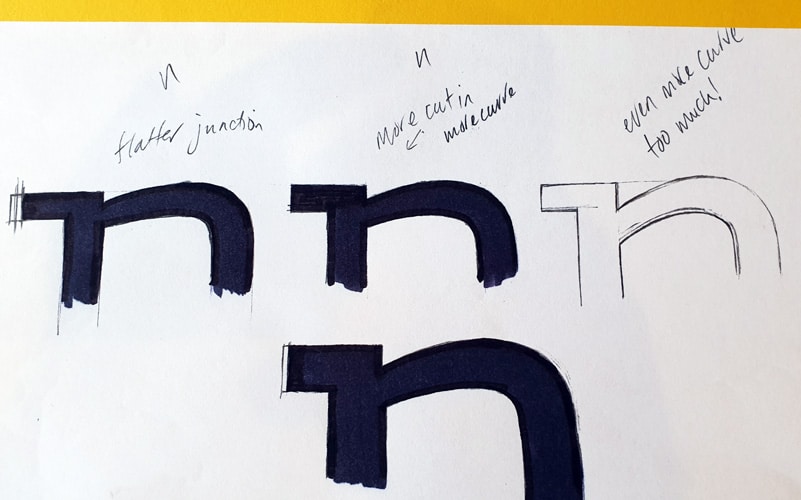
Foundry Origin ‘n’ junction development sketch.
Foundry Origin, Grafik 167, Oct 2008, p.74.
Foundry Origin, Grafik 167, Oct 2008, p.74.