The Foundry Types new typeface for the Dutch Design Week in collaboration with Thonik.
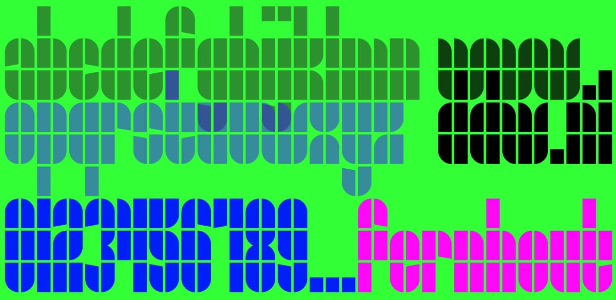
Fernhout is the new typeface designed by The Foundry Types for the Dutch Design Week (DDW), in collaboration with world-leading Amsterdam design agency Thonik. The new display face is based on the simple primitive forms, rectangles, and quarter-circles by the late great Wim Crouwel’s ‘Edgar Fernhout’ exhibition poster and catalogue for the Van Abbemuseum in 1963. The typeface and brand identity is currently being rolled out across The Netherlands.
Hosted by the city of Eindhoven, DDW is the biggest design event in Northern Europe. With over 2500 designers, scattered over 110 locations, showcasing their work to more than 350,000 visitors from across the globe. DDW coordinates exhibitions, lectures, prize ceremonies, networking events, debates and other festivities.
Thonik approached The Foundry Types and asked them to create a typeface based on the new logo they had designed, expanding the character set to include a-z in lowercase, figures, and punctuation glyphs. The Foundry Types’ objective was simple: to create a clear expansion of the Crouwel ‘Edgar Fernhout’ letterforms that seamlessly integrates with the new DDW brand identity.
The Foundry Types’ ethos throughout the design process was clarity, integrity and authenticity; the constructed ‘Edgar Fernhout’ letterforms consist of a simplistic rectangle block system, two columns wide and four oblongs tall, circled segments and angled indentations. Although the glyph shapes are playful and simple – these basic forms often throw up challenging complex problems and limitations.
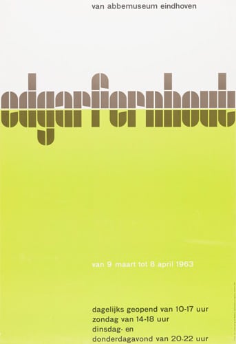
Wim Crouwel’s ‘edgarfernhout’ poster for Van Abbemuseum, Eindhoven 1963.
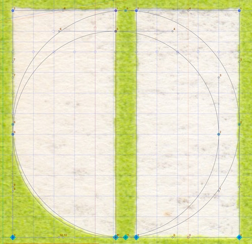
The scan and grid behind the ‘fernhout’ typeface.
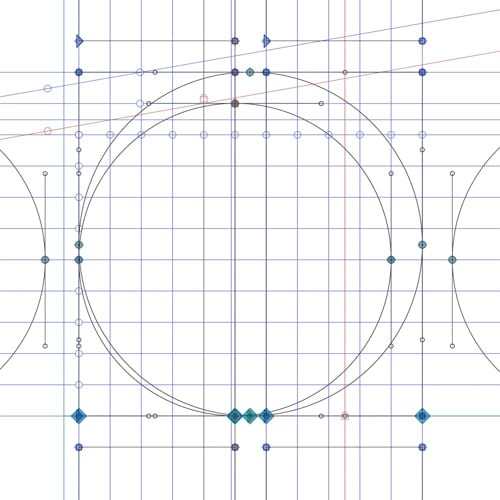
The grid behind the ‘fernhout’ typeface.
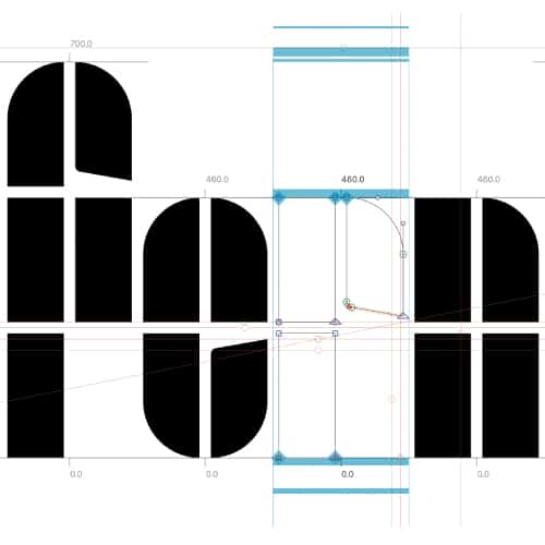
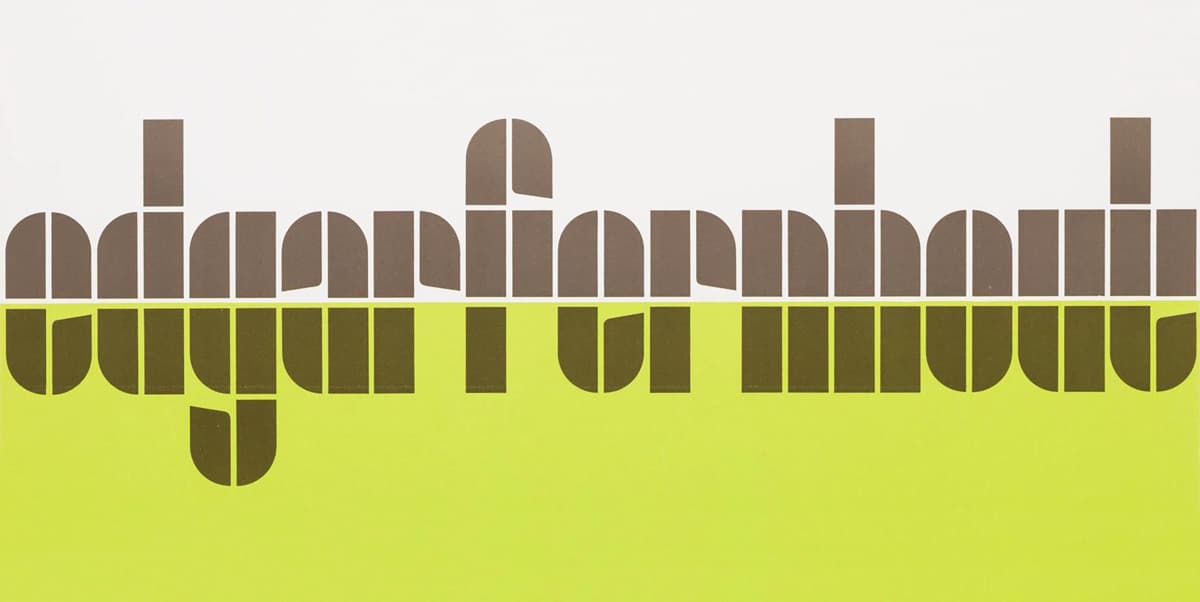
Development of the ‘fernhout’ typeface.
The purist, basic forms of ‘Fernhout’ offer little scope to break the grid without diminishing the overall visual virtues. Crouwel’s carefully devised grid often allowed many glyphs to design themselves, but complex glyphs with diagonal strokes, ‘k, s, x, z, 2, 4, 5, 7’ needed to be stripped back and simplified. Characteristics within the letterforms also threw up a few dilemmas – how to design an ‘i and j’ dot along with readable punctuation? The Foundry Types decided to introduce another element – the square, this allowed a little more freedom to express the concept in a more refined way. Problematic junctions to the center section of the ‘3 and 8’ were the trickiest to achieve, a double quarter-circle was added to allow these glyphs to be easily recognizable.
Thomas Widdershoven (Co-founder Thonik) said, ‘Crouwel loved monospaced letters so the fact that Edgar Fernhout’s name doesn’t contain a ‘w, m, l, or i’ must have appealed to him. We did have to tackle those letters and have tried to finish the game while playing by the same rules. We’ve chosen all lowercase letters since they feel more democratic and look sympathetic. The use of indentations has helped increase legibility’.
Stuart de Rozario (The Foundry Types) said, ‘Just like Crouwel’s lettering, his posters and catalogues are unique. All vary in style and execution, often displaying humanity within his strict modular grid vision: systematic, logical, but crafted by hand and with a keen eye’.
David Quay (The Foundry Types) said, ‘Wim never envisaged his designs to go on to be used as complete typefaces, and would often be taken aback to know people would want to use them in their own design projects’.
Roy Terhorst (Partner – Thonik) said, ‘Animating the newly developed font for the DDW site felt natural, when the letters started moving, the underlying grid became visually present. A bridge was forged between the aesthetics of the past and the design language of the future: motion design’.
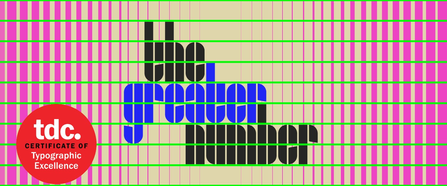
The Fernhout typeface consists of just a single weight with a very limited character set due to its elemental forms. The Fernhout typeface will be available to licence later this year at The Foundry Types exclusively, a pdf specimen is available on request.
The Dutch Design Week commences 16–24 October 2021. We hope to see you there.
Our special thanks goes to Thomas Widdershoven and Roy Terhorst at Thonik for their kind permission to showcase the animations.
Related articles