4 styles
Tester
Weights


Glyphs
About New Alphabet
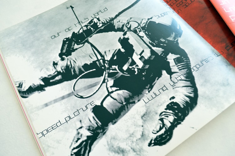
New Alphabet, created as a four weight family in close collaboration with Wim Crouwel. His most radical experiment, conceived during the late 1960s in response to his experience of the first device for electronic phototypesetting; characters were designed to follow the underlying dot-matrix system. With his strong interest in grids, Crouwel worked within the constraints of existing electronic technology, producing characters that worked with the mechanical means that conveyed them.
A personal, experimental project where Wim embraced the limitations of Cathode Ray Tube technology – used by early electronic screens and phototypesetting equipment. Conventional typefaces suffered under these extreme conditions. Crouwel’s premise was to adapt the design to work within the new technology by creating letterforms that only contained horizontals and verticals, Crouwel explained, ‘It would have to be based on a pattern of horizontal and vertical rows of pixels and a 45-degree angle. When you enlarged, reduced, widened or narrowed it, the patterns would always remain the same. That was the cornerstone for everything’.
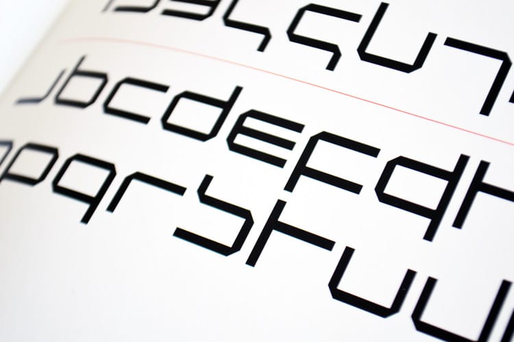
The letters were based on a 5 by 9 grid, with 45-degree corners. There is no differentiation between uppercase and lowercase except for a bar above the letter to indicate a capital. The letters m and w have a bar below indicating they are double width characters, differentiating them from the n and u. Many of his peers were of the opinion that the design was too experimental and that it went too far. So much so, that it received a lot of publicity and lively debate. For Crouwel it was mostly a theoretical exercise and never intended the typeface to be used but to stimulate discussion, instead it caused a furore. The New Alphabet was a radical experiment, a point of departure and discussion, it was never meant to be used.
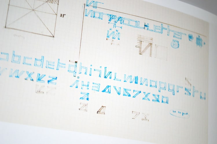
Wim Crouwel’s original development sketches for New Alphabet.
Wim Crouwel’s original development sketches for New Alphabet.
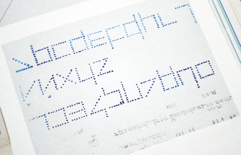
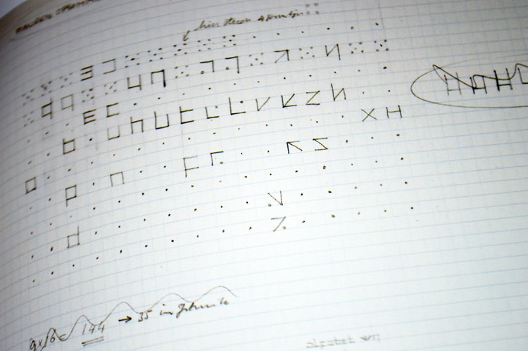
Wim Crouwel’s original development ‘dot’ sketches for New Alphabet.
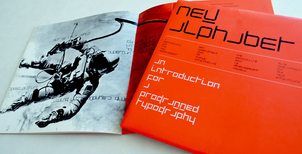
Wim Crouwel’s New Alphabet specimen from 1967.
Wim Crouwel’s New Alphabet specimen from 1967.
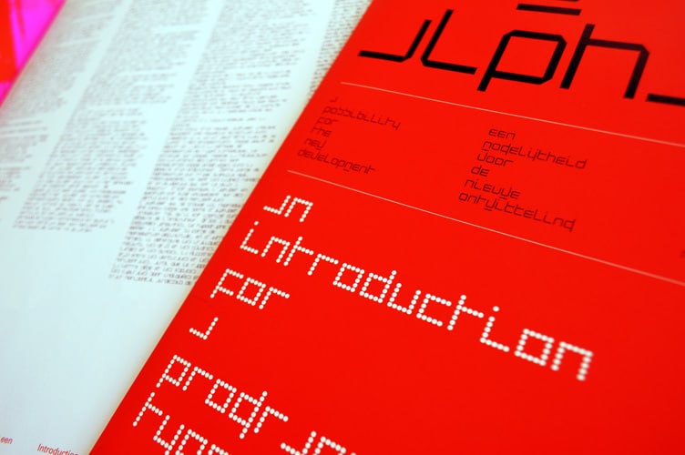
Wim Crouwel’s New Alphabet specimen from 1967.
Licence New Alphabet through Monotype
The original Foundry font collection is currently available exclusively from Monotype, you can purchase a licence to use these typefaces at Fonts.com, FontShop, Linotype, and MyFonts, via the following links.