5 styles
Tester
Weights
Glyphs
Languages
Abenaki, Afaan Oromo, Afar, Afrikaans, Albanian, Alsatian, Amis, Anuta, Aragonese, Aranese, Arrernte, Arvanitic, Asturian, Aymara, Basque, Bikol, Bislama, Breton, Cape Verdean, Catalan, Cebuano, Chamorro, Chavacano, Chickasaw, Cofan, Corsican, Danish, Dawan, Delaware, Dholuo, Drehu, Dutch, English, Estonian, Faroese, Fijian, Filipino, Finnish, Folkspraak, French, Frisian, Friulian, Galician, Genoese, German, Gooniyandi, Greenlandic, Guadeloupean, Gwichin, Haitian Creole, Han, Hiligaynon, Hopi, Icelandic, Ido, Ilocano, Indonesian, Interglossa, Interlingua, Irish, Italian, Jamaican, Javanese, Jerriais, Kala Lagaw Ya, Kapampangan, Kaqchikel, Kikongo, Kinyarwanda, Kiribati, Kirundi, Klingon, Latin, Latino Sine, Lojban, Lombard, Low Saxon, Luxembourgish, Makhuwa, Malay, Manx, Marquesan, Meriam Mir, Mohawk, Montagnais, Murrinhpatha, Nagamese Creole, Ndebele, Neapolitan, Ngiyambaa, Norwegian, Novial, Occidental, Occitan, Oshiwambo, Palauan, Papiamento, Piedmontese, Portuguese, Potawatomi, Qeqchi, Quechua, Rarotongan, Romansh, Rotokas, Sami Southern, Samoan, Sango, Saramaccan, Sardinian, Scottish Gaelic, Seri, Seychellois, Shawnee, Shona, Sicilian, Slovio, Somali, Sotho Northern, Sotho Southern, Spanish, Sranan, Sundanese, Swahili, Swazi, Swedish, Tagalog, Tetum, Tok Pisin, Tokelauan, Tshiluba, Tsonga, Tswana, Tumbuka, Tzotzil, Ukrainian, Uzbek, Venetian, Volapuk, Voro, Walloon, Waraywaray, Warlpiri, Wayuu, Wikmungkan, Wiradjuri, Xhosa, Yapese, Yindjibarndi, Zapotec, Zulu, Zuni
About Foundry Fabriek
The name Foundry Fabriek derives from industrial fabrication, where the parts of any material or structure are united. The systematic grid, formed by stencil shapes, is indicative of the work of Wim Crouwel, consultant on this typeface family.
Originally, Foundry Fabriek started as a commission through Wim who recommended David Quay to Interior and Industrial design specialists, Kho Liang Ie. They were tasked with designing an interior section of a new office building for the insurance company, Interpolis in Tilburg, South of Netherlands. Commissioned to create a stencil (sjabloon, in Dutch) typeface based on Foundry Gridnik which would be laser cut into large steel panels. The panels were then assembled to display a series of uplifting poems.
David states, ‘The inside angle shapes had to have a radius as the laser could not cut into the corners easily, the outside angels could be left square. The final result was satisfactory but I felt there was something unresolved in the way the end diagonals of the ‘A, V, W, X, Y, v, w, x and y’, terminated – they seemed to fight against the vertical stress of the letters which is enhanced by the vertical cuts of the stencil. I resolved it by adding a straight on the inside’.
The concept of a machine made industrial font with a human touch, creates a solidified design. Paired back stencil breaks are thoughtful in their relation to non-joining components, not every glyph has a break but a harmonious rhythm. Creating positive and negative spaces, which highlight a playful robust texture.
The five weight progression gives Foundry Fabriek flexibility for a variety of applications. The characteristic letterforms take on an extra dynamic when used large, especially cast in concrete or laser cut out of metal, which forms integrated components in architectural and signage projects.
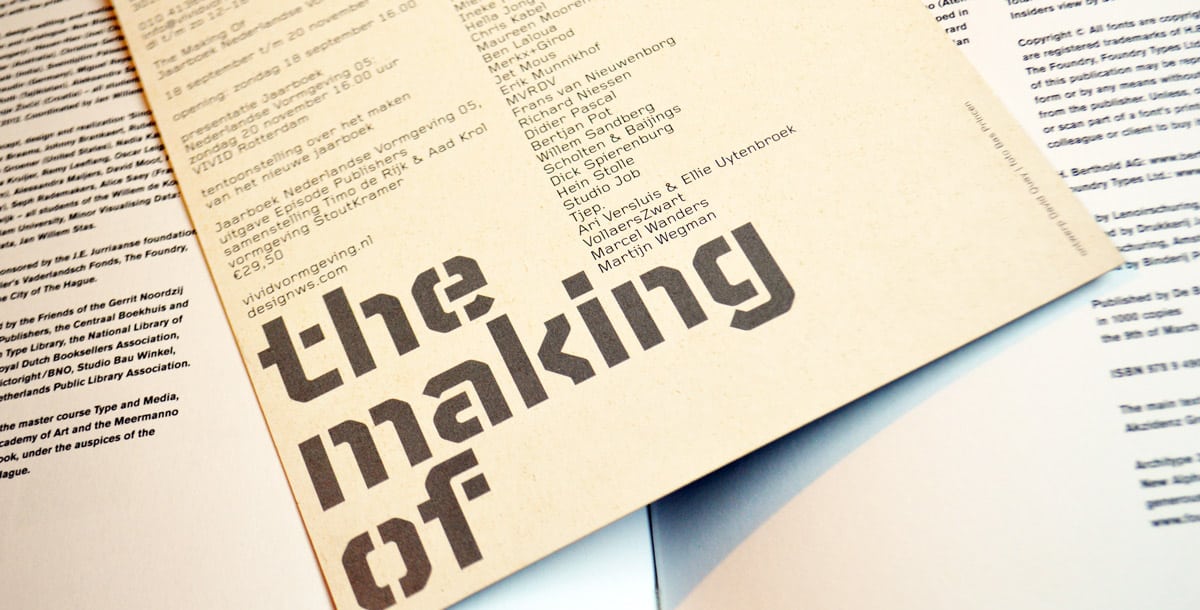
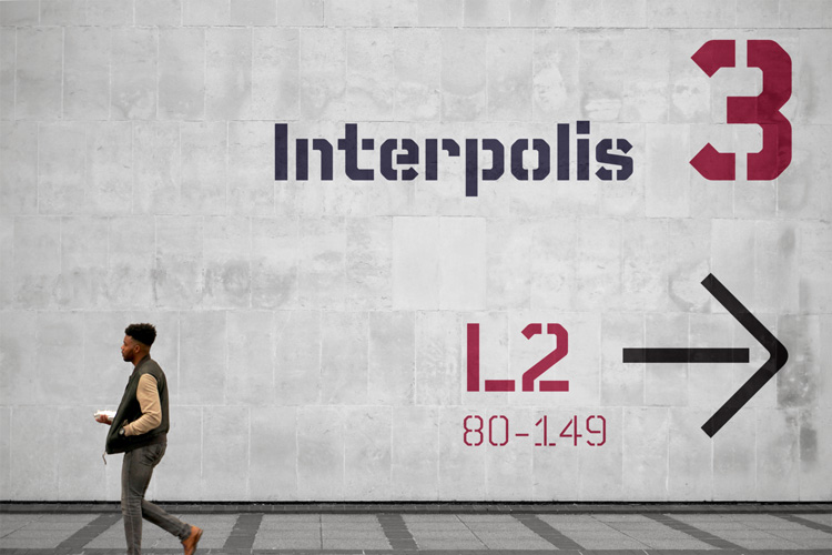
Foundry Fabriek Interpolis
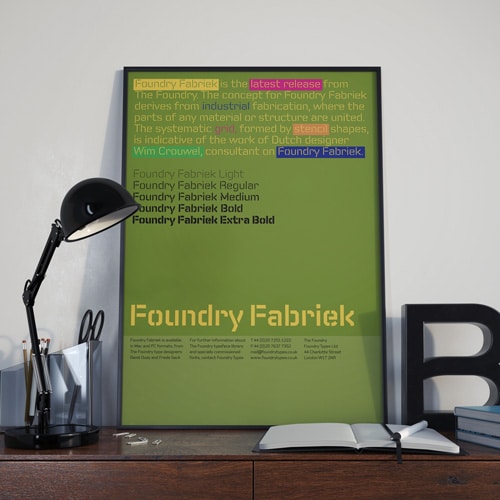
Foundry Fabriek poster.
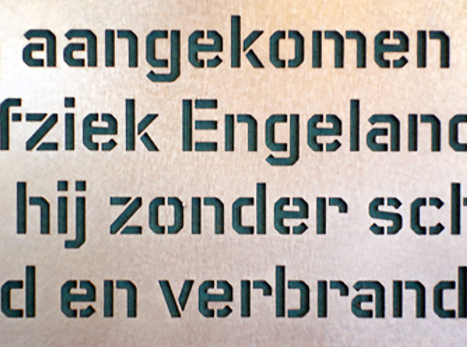
Foundry Fabriek, cast iron at the Interpolis building.
In use
Experimental Formats.2, © RotoVision.
Designed by Roger Fawcett-Tang at Struktur Design.
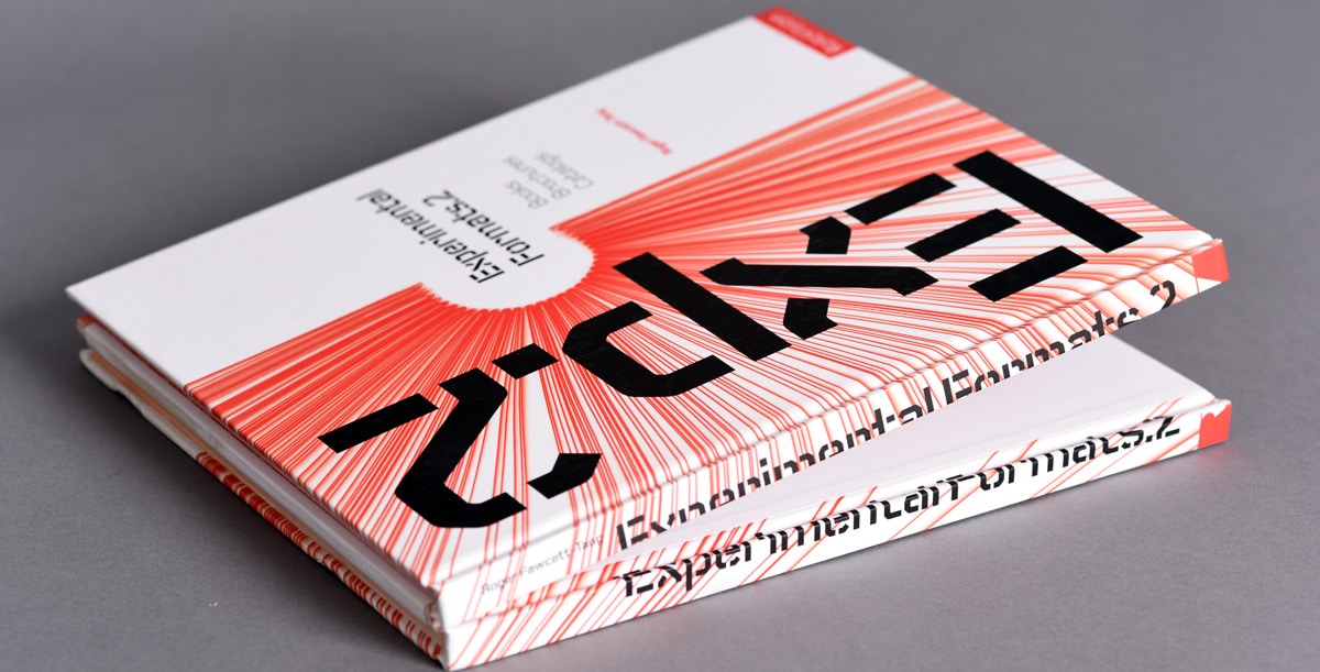
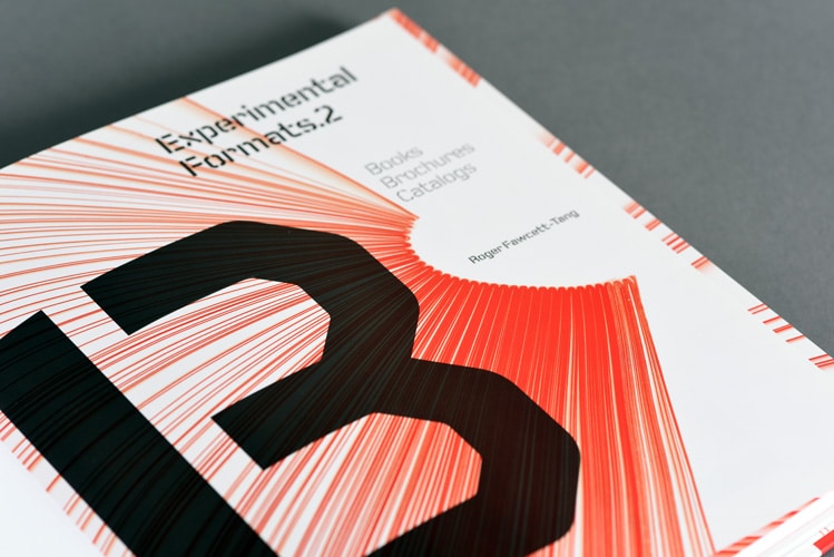
Experimental Formats.2 – Books, Brochures, Catalogs, © RotoVision. Design by Struktur Design using Foundry Fabriek.
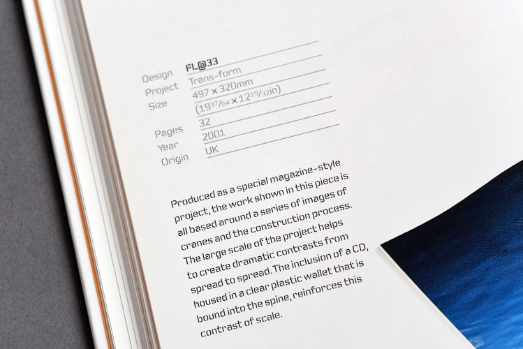
Experimental Formats.2 – Books, Brochures, Catalogs, © RotoVision. Design by Struktur Design using Foundry Fabriek.
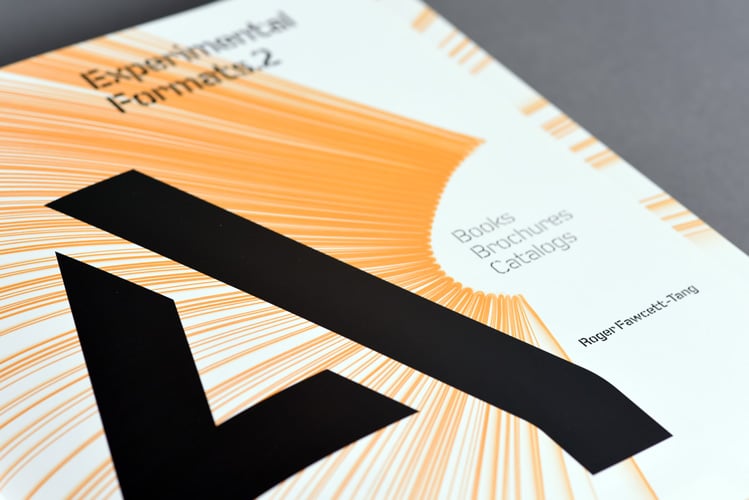
Experimental Formats.2 – Books, Brochures, Catalogs, © RotoVision. Design by Struktur Design using Foundry Fabriek.
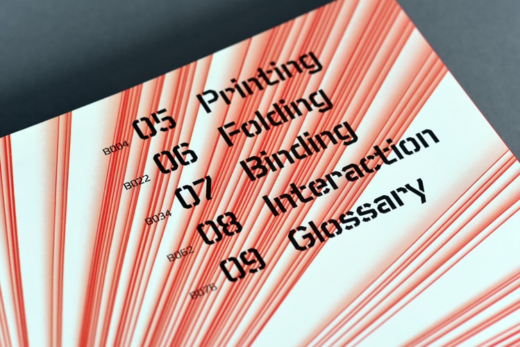
Experimental Formats.2 – Books, Brochures, Catalogs, © RotoVision. Design by Struktur Design using Foundry Fabriek.
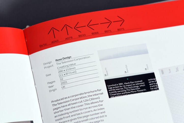
Experimental Formats.2 – Books, Brochures, Catalogs, © RotoVision. Design by Struktur Design using Foundry Fabriek.
Licence Foundry Fabriek through Monotype
The original Foundry font collection is currently available exclusively from Monotype, you can purchase a licence to use these typefaces at Fonts.com, FontShop, Linotype, and MyFonts, via the following links.