39 styles
Tester
Weights
Glyphs
Languages
Abenaki, Afaan Oromo, Afar, Afrikaans, Albanian, Alsatian, Amis, Anuta, Aragonese, Aranese, Aromanian, Arrernte, Arvanitic, Asturian, Atayal, Aymara, Bashkir, Basque, Belarusian, Bemba, Bikol, Bislama, Bosnian, Breton, Bulgarian Romanization, Cape Verdean, Catalan, Cebuano, Chamorro, Chavacano, Chichewa, Chickasaw, Cimbrian, Cofan, Corsican, Creek, Crimean Tatar, Croatian, Czech, Danish, Dawan, Delaware, Dholuo, Drehu, Dutch, English, Esperanto, Estonian, Faroese, Fijian, Filipino, Finnish, Folkspraak, French, Frisian, Friulian, Gagauz, Galician, Ganda, Genoese, German, Gikuyu, Gooniyandi, Greenlandic, Greenlandic Old Orthography, Guadeloupean, Gwichin, Haitian Creole, Han, Hawaiian, Hiligaynon, Hopi, Hotcak, Hungarian, Icelandic, Ido, Ilocano, Indonesian, Interglossa, Interlingua, Irish, Istroromanian, Italian, Jamaican, Javanese, Jerriais, Kala Lagaw Ya, Kapampangan, Kaqchikel, Karakalpak, Karelian, Kashubian, Kikongo, Kinyarwanda, Kiribati, Kirundi, Klingon, Kurdish, Ladin, Latin, Latino Sine, Latvian, Lithuanian, Lojban, Lombard, Low Saxon, Luxembourgish, Maasai, Makhuwa, Malay, Maltese, Manx, Maori, Marquesan, Meglenoromanian, Meriam Mir, Mirandese, Mohawk, Moldovan, Montagnais, Montenegrin, Murrinhpatha, Nagamese Creole, Ndebele, Neapolitan, Ngiyambaa, Niuean, Noongar, Norwegian, Novial, Occidental, Occitan, Oshiwambo, Ossetian, Palauan, Papiamento, Piedmontese, Polish, Portuguese, Potawatomi, Qeqchi, Quechua, Rarotongan, Romanian, Romansh, Rotokas, Sami Inari, Sami Lule, Sami Northern, Sami Southern, Samoan, Sango, Saramaccan, Sardinian, Scottish Gaelic, Serbian, Seri, Seychellois, Shawnee, Shona, Sicilian, Silesian, Slovak, Slovenian, Slovio, Somali, Sorbian Lower, Sorbian Upper, Sotho Northern, Sotho Southern, Spanish, Sranan, Sundanese, Swahili, Swazi, Swedish, Tagalog, Tahitian, Tetum, Tok Pisin, Tokelauan, Tongan, Tshiluba, Tsonga, Tswana, Tumbuka, Turkish, Turkmen, Tuvaluan, Tzotzil, Ukrainian, Uzbek, Venetian, Vepsian, Volapuk, Voro, Wallisian, Walloon, Waraywaray, Warlpiri, Wayuu, Welsh, Wikmungkan, Wiradjuri, Wolof, Xavante, Xhosa, Yapese, Yindjibarndi, Zapotec, Zulu, Zuni.
About Foundry Arkias
The ‘International Typographic Style’, also known as ‘Swiss Style’, emerged in the mid-20th century, captivating designers worldwide with its clean lines, harmonious compositions and unwavering dedication to simplicity. Deriving from Switzerland and Germany during the 1950s, the style was revolutionary and emphasized objective clarity by using compositional grids and sans serif typography as the primary design material (or element).
Swiss designer, Josef Müller-Brockmann, one of the ‘Swiss Style’ pioneers, sought an absolute and universal form of graphic expression through objective and impersonal presentation, communicating to the audience without the interference of the designer’s subjective feelings or propagandistic techniques of persuasion. He challenged the ornate and cluttered design aesthetics of the time, embracing a minimalist approach that would forever change the course of graphic design.
Swiss pharmaceutical company, J. R. Geigy A.G embraced wholeheartedly the new objectivity of the International Typographic Style and became one of its leading proponents. During the 1950s and 1960s, under the stewardship of Max Schmid, the studio employed talented graphic artists of the generation: Roland Aeschlimann, Karl Gerstner, Jörg Hamburger, Steff Geissbuhler, Andreas His, Toshihiro Katayama and Nelly Rudin. And many freelance designers such as Michael Engelmann, Gottfried Honegger, Armin Hofmann, Herbert Leupin, Warja Lavater, Numa Rick and Niklaus Stoecklin also played a vital role in developing the Geigy brand.
In 1954, Andreas His designed a range of insecticide and herbicide packaging for the Swiss company, ‘Desogen, Mesulfan, Gesarex, Gesarol, Gesin and Gesakupfer’. Colourful, simplistic and modern, only the necessary basic information was required, as with all Geigy products, promotion and packaging, there was never any overselling. Everything is stripped to the essentials, even the letters in the Geigy and product name have been simplified. The ‘e, d, g and u’, have lost their terminals and the ‘f and t’, the left side of their horizontal stroke – you could argue that this could have been Geigy’s first corporate typeface.
This is the inspiration behind Foundry Arkias, but this is not a slavish copy. We aim to create something new and original. A modern interpretation that inspires typographic creativity.
Foundry Arkias’ core visual structure, vertical axis and modular forms, along with the narrow proportions, bring a robust tone of voice. Higher contrast in heavier weights is emphasized, less so in the thin styles. The most distinguishable feature of Foundry Arkias is its modular, arched, dome-like forms, coinciding with the pinched connecting strokes to eradicate dark spots at joining junctions. Primarily designed for display usage, the large x-height, clean appearance and modular characteristics make Foundry Arkias, a distinctive font for contemporary and cultured environments.
Take a closer look at the individual letters – ‘K, J, Q, X, a, b, f, g, j, k, n, r, t, w, x and y’, they all have alternative forms to play with, enabling you more scope to mix up your creativity. Appealing to a spectrum of branding sectors and where applications for print, screen and mobile are at a premium.
Foundry Arkias is a testament to our belief that design is not just about making things look good, but about making a statement, about creating an impact, with craft and meticulous care. To create something meaningful. The extreme lighter styles make a more subtle appearance, setting a softer tone, the heavier styles bring a unique blend of modernity and nostalgia.
Foundry Arkias, our latest typeface is now available and comes in a 39-style family consisting of Hairline, Thin, ExtraLight, UltraLight, Light, Regular, Medium, DemiBold, SemiBold, Bold, ExtraBold, Black and Heavy. Each style comes with Italics and a Reclined version. The character set includes multiple alternative lowercase glyphs, a set of positive and negative circled numbers, a Bitcoin symbol, arrows, and extended ligatures including a ‘www’ ligature.
Additionally, Foundry Arkias is now available in OpenType and TrueType formats for Desktop, WOFF and WOFF2 for Web and as a Variable Font. The Variable font version offers a great range of benefits such as reducing file size and almost infinitum styles ranging from the Hairline through to the Heavy. The Variable Fonts are available on complete family purchases only.
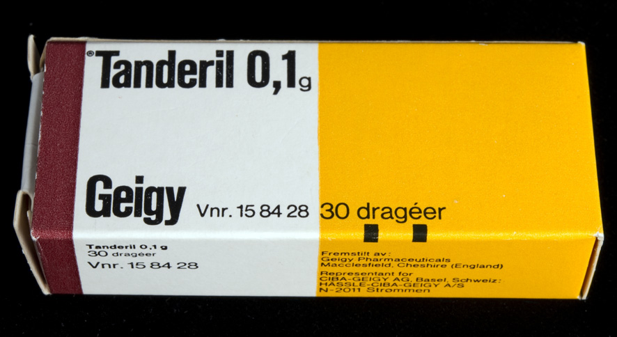
Tanderil 0,1g. Geigy packaging design by Andreas His, ca 1954
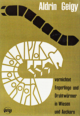
Aldrin Geigy poster, designed by Andreas His, ca 1956
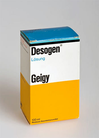
Desogen, Geigy packaging, designed by Andreas His, ca 1956
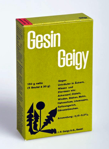
Gesin, Geigy packaging, designed by Andreas His, ca 1954
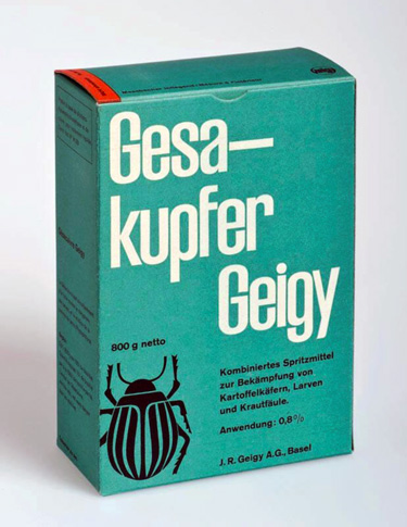
Gesakupfer, Geigy packaging, designed by Andreas His, ca 1954
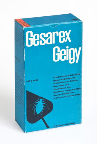
Gesarex, Geigy packaging, designed by Andreas His, ca 1954
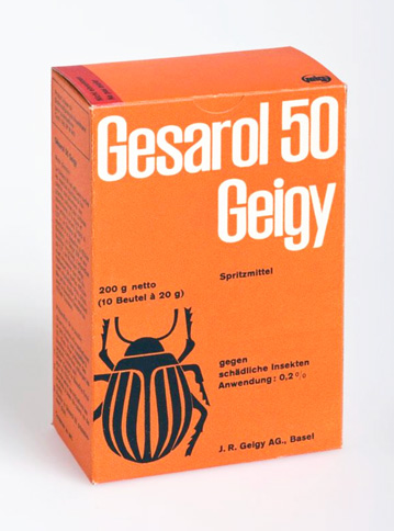
Gesarol, Geigy packaging, designed by Andreas His, ca 1954
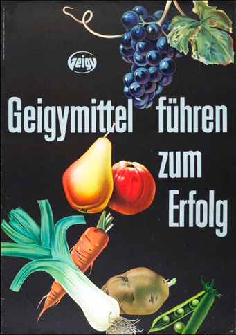
Geigymittel führen zum Erfolg, a Geigy poster designed by Willi Günthart-Maag, ca 1950
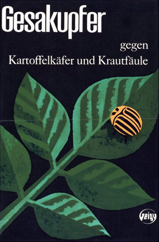
A Gesakupfer Geigy catalogue cover, designed by Max Schmid, date unknown
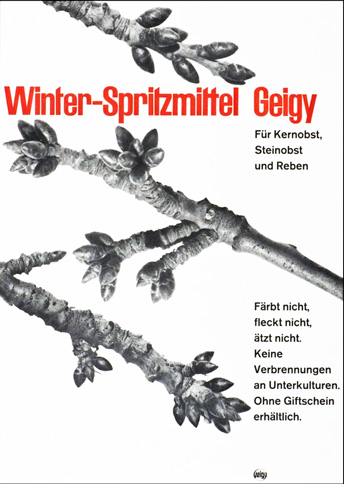
Winter-Spritzmittel Geigy advertisment, designed by Jörg Hamburger, ca 1956
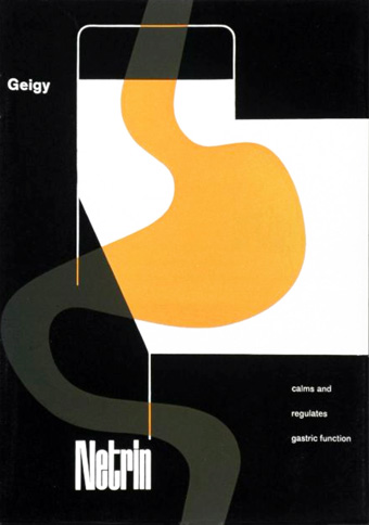
A Netrin Geigy catalogue, designer unknown, ca 1956
Download trial font
The trial fonts are not for commercial use. By submitting this 'Download trial font' form, you are agreeing to receive marketing and communication emails from The Foundry Types. These are very occasional, and you can unsubscribe at any time. A download link to the trial fonts will be sent to your email address.