4 styles
Tester
Weights


Glyphs
Languages
Afrikaans, Albanian, Asu, Basque, Bemba, Bena, Catalan, Cebuano, Chiga, Cornish, Corsican, Danish, English, Filipino, French, Friulian, Galician, German, Gusii, Ido, Indonesian, Interlingua, Irish, Italian, Javanese, Jju, Kabuverdianu, Kalenjin, Kinyarwanda, Lojban, Low German, Luo, Luxembourgish, Luyia, Machame, Makhuwa-Meetto, Makonde, Malagasy, Malay, Manx, Morisyen, North Ndebele, Norwegian Bokmål, Norwegian Nynorsk, Nyankole, Occitan, Oromo, Portuguese, Romansh, Rombo, Rundi, Rwa, Samburu, Sango, Sangu, Sardinian, Scottish Gaelic, Sena, Shambala, Shona, Soga, Somali, South Ndebele, Southern Sotho, Swahili, Swati, Swedish, Swiss German, Taita, Taroko, Teso, Tsonga, Tswana, Vunjo, Walloon, Xhosa, Zulu
About Architype Ingenieur
With our longstanding collaboration with Wim Crouwel, Architype Ingenieur was created in 2011 and released in the following summer of 2012. One of the last hands-on typeface collaborations with the dutch visionary. Aimed to showcase Wim’s essential grid system lettering – the original reference dates back to his ‘orlanda‘ letterforms of the 1960s.
Influenced by his boyhood fascination with naval warship lettering, Crouwel designed the grid-based type with 45-degree angles for the curved strokes on the ‘Olanda’ exhibition catalogues and posters for the Dutch entry to the 1960 Venice Biennale.
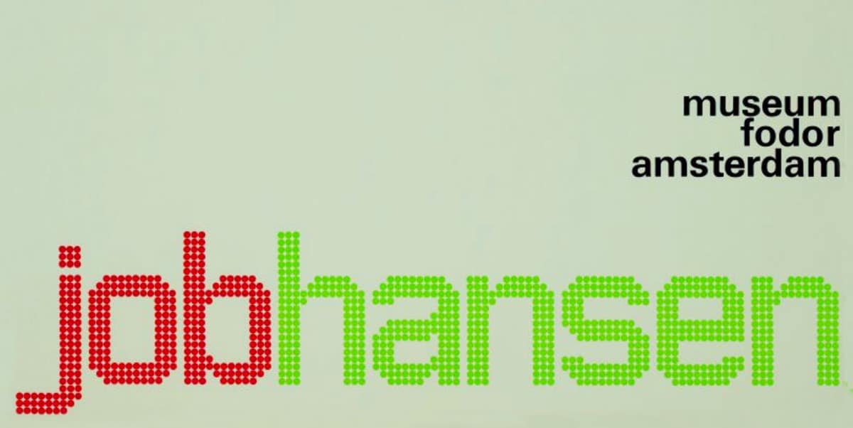
Subtle variations appeared in the Stedelijk Museum catalogues for the Belgian painter Jean Brusselmans in ‘brusselmans’ of 1960 and the catalogue for the German painter and sculptor Ewald Mataré, ‘mataré’ of 1964. The core design grid was in place, also several dot matrix versions followed such as the poster for the Dutch artist Jacob Gerard Hansen on the Fodor Museum poster ‘Job Hansen’ in 1964. This example shows a slight adaptation, the small detail of the thin joining stroke to the stem shows movement by dropping the dot down one step on the grid. This dot matrix version broadened the scope of the principle letterform system and encouraged more capabilities and possibilities for other letterforms to come.
The clean, geometrically constructed and simplified grid system transmits a sharp but subtle engineered aesthetic. Its soft internal radius combined with the curveless round glyphs and strong horizontal emphasise enhance Wim’s purist approach.
Architype Ingenieur’s name came from a Wim Crouwel quote ‘I am an engineer, troubled by aesthetics’. The themes and systems in these early inspired letterforms are encapsulated in this four weight family of Light, Regular, Bold and Dot.
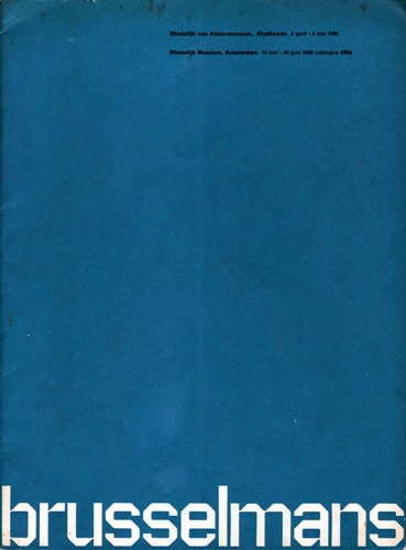
Wim Crouwel’s ‘brusselmans’, poster from 1960.
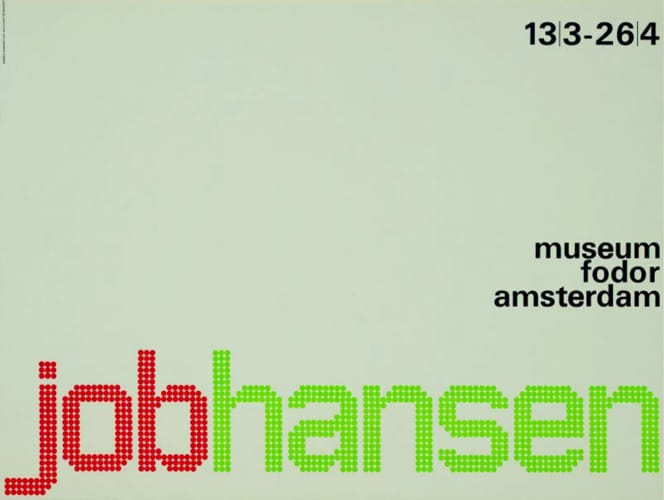
Wim Crouwel’s ‘job hansen’ poster from 1964.
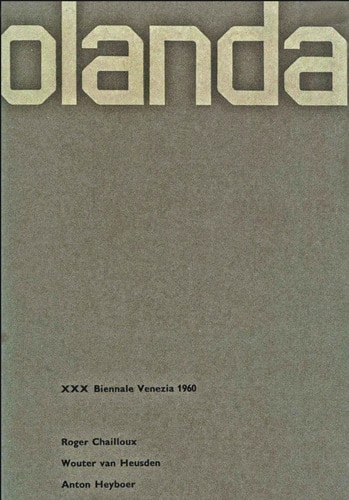
Wim Crouwel’s ‘olanda – XXX Biennale Venezia’, 1960.
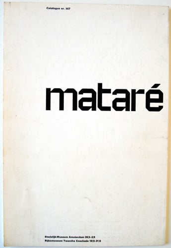
Wim Crouwel’s ‘matare’ catalogue from 1964.
Licence Architype Ingenieur through Monotype
The original Foundry font collection is currently available exclusively from Monotype, you can purchase a licence to use these typefaces at Fonts.com, FontShop, Linotype, and MyFonts, via the following links.