1 styles
Tester
Weights
Glyphs
Languages
English, Indonesian, Zulu, Latin
About Fernhout
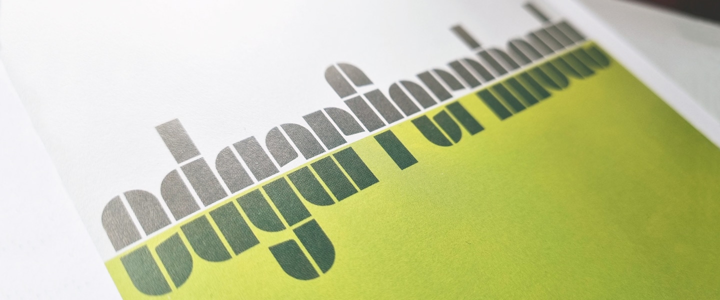
In 1963, the Van Abbemuseum commissioned Dutch designer, Wim Crouwel to design the exhibition poster and catalogue for the Dutch painter, Edgar Fernhout. Crouwel’s elegant solution for the main title lettering, ‘edgarfernhout’ was to design a simple rectangular block system two wide by three high, circled segments and angled indentations formulate the glyphs and grid.
Crouwel’s carefully devised grid often allowed many glyphs to design themselves, but complex glyphs with diagonal strokes, ‘k, s, x, z, 2, 4, 5, 7’ were difficult to achieve given the constraints that Crouwel had devised. With some of the more difficult and complex glyphs, we introduced an extra element without compromising Wim’s original concept, hopefully, he would have approved.
In the book ‘Wim Crouwel – Alphabets’, David Quay asked Wim about his approach to the Fernhout lettering:
DQ: The poster for an exhibition of paintings by Edgar Fernhout, you seem to have approached the form of the letters differently. What was the principle here?’.
WC: I find this one of the most attractive. It refers back to the system in the ‘Hiroshima’ and the ‘Triennial’ posters. The form is inspired by the abstract landscapes that Edgar Fernhout was making when I first met him. They were built up with short brushstrokes, in beautiful structures.
DQ: I see a division in the form letters.
WC: There is a clear division in four sections, all with elements of the same height. Because of Fernhout’s landscapes, I also introduced a horizon. I also wantedto bring in that reflexion, that Dutchness, here.
DQ: Were you already thinking then that you could work this out into a complete alphabet?’
WC: No, never. I just made these words. At the time, I was not concerned with that at all. That only first started in 1967.
DQ: At the Bauhaus, then, Josef Albers was experimenting with letters like these. Did you already know about them
WC: That alphabet by Albers – I think I knew it. It might have had some indirect influence, but what concerned me was the construction of letters. Tschichold was doing it as well. Yes, that was my world.
David concluded, ‘Wim never envisaged his designs to go on to be used as complete typefaces, and would often be taken aback to know people would want to use them in their own design projects’.
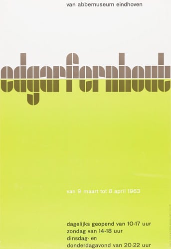
Wim Crouwel’s ‘edgarfernhout’ poster for Van Abbemuseum, Eindhoven 1963.
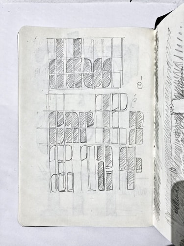
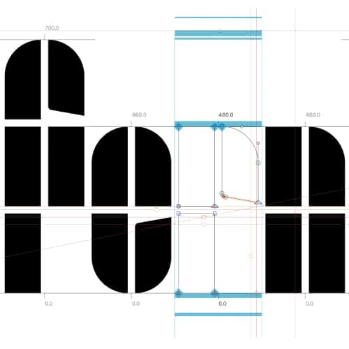
David’s pencil sketch for the ‘Fernhout’ figures.
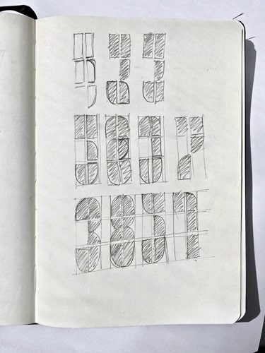
David’s pencil sketch for the ‘Fernhout’ figures.
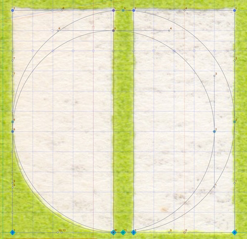
The scan and grid behind the ‘fernhout’ typeface.
The grid behind the ‘fernhout’ typeface.
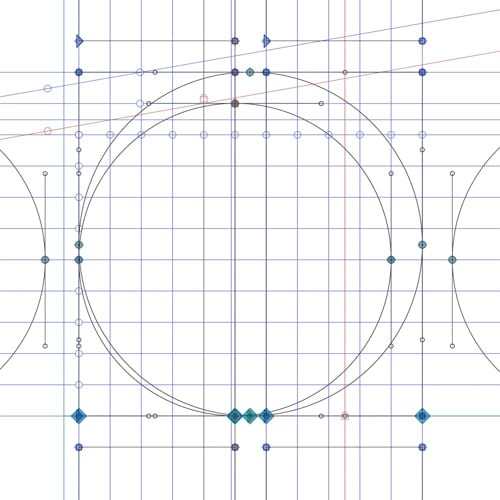
Development of the ‘fernhout’ typeface.


In use
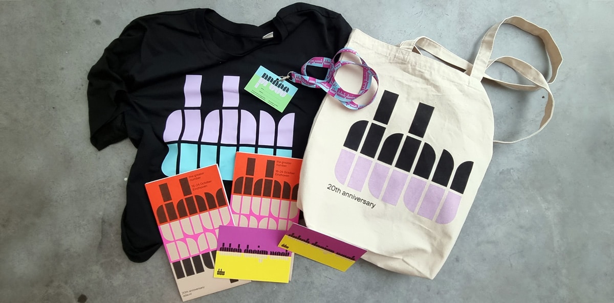
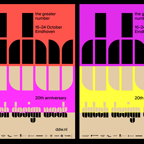
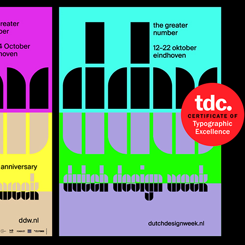
Fernhout, designed in collaboration with Thonik for the Dutch Design Week 2021, Eindhoven.
Read about our case study here
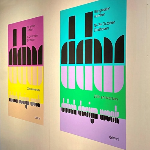
DDW – Dutch Design Week 2021 – The Greater Number posters
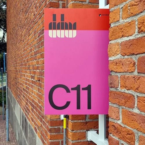
DDW – Dutch Design Week 2021 sign
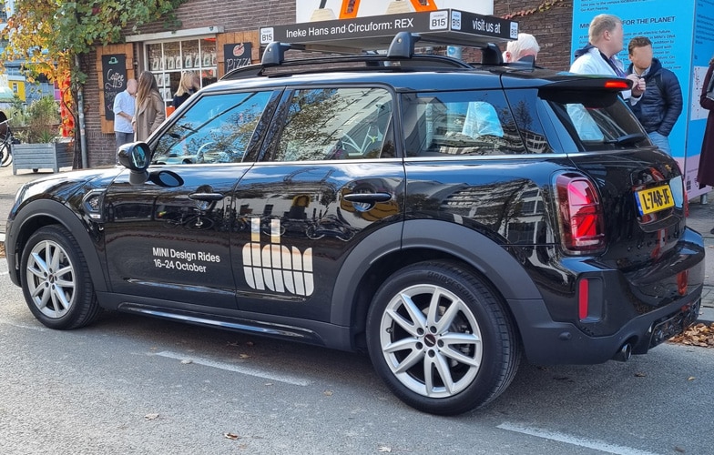
DDW – Dutch Design Week 2021 taxi
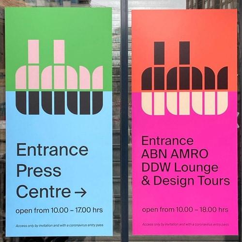
DDW – Dutch Design Week 2021 posters
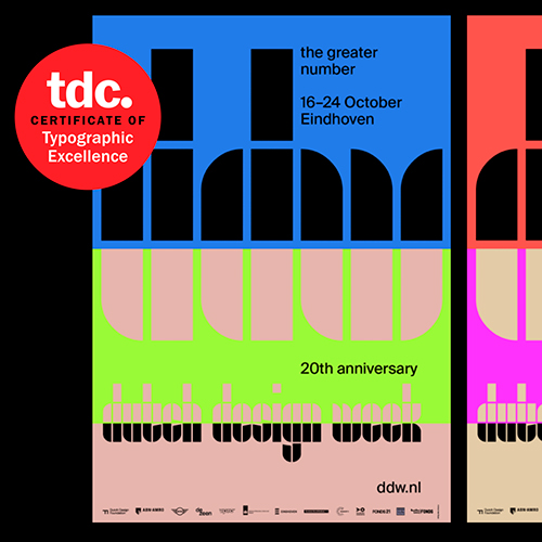
DDW, winner of a Type Directors Club Award for Typographic Excellence, images courtesy of Thonik.
DDW, winner of a Type Directors Club Award for Typographic Excellence, images courtesy of Thonik.
DDW, winner of a Type Directors Club Award for Typographic Excellence, images courtesy of Thonik.
Download trial font
The trial fonts are not for commercial use. By submitting this 'Download trial font' form, you are agreeing to receive marketing and communication emails from The Foundry Types. These are very occasional, and you can unsubscribe at any time. A download link to the trial fonts will be sent to your email address.