4 styles
Tester
Weights


Glyphs
Languages
Abenaki, Afaan Oromo, Afar, Afrikaans, Albanian, Alsatian, Amis, Anuta, Aragonese, Aranese, Arrernte, Arvanitic, Asturian, Aymara, Basque, Bikol, Bislama, Breton, Cape Verdean, Catalan, Cebuano, Chamorro, Chavacano, Chickasaw, Cofan, Corsican, Danish, Dawan, Delaware, Dholuo, Drehu, Dutch, English, Estonian, Faroese, Fijian, Filipino, Finnish, Folkspraak, French, Frisian, Friulian, Galician, Genoese, German, Gooniyandi, Greenlandic, Guadeloupean, Gwichin, Haitian Creole, Han, Hiligaynon, Hopi, Icelandic, Ido, Ilocano, Indonesian, Interglossa, Interlingua, Irish, Italian, Jamaican, Javanese, Jerriais, Kala Lagaw Ya, Kapampangan, Kaqchikel, Kikongo, Kinyarwanda, Kiribati, Kirundi, Klingon, Latin, Latino Sine, Lojban, Lombard, Low Saxon, Luxembourgish, Makhuwa, Malay, Manx, Marquesan, Meriam Mir, Mohawk, Montagnais, Murrinhpatha, Nagamese Creole, Ndebele, Neapolitan, Ngiyambaa, Norwegian, Novial, Occidental, Occitan, Oshiwambo, Palauan, Papiamento, Piedmontese, Portuguese, Potawatomi, Qeqchi, Quechua, Rarotongan, Romansh, Rotokas, Sami Southern, Samoan, Sango, Saramaccan, Sardinian, Scottish Gaelic, Seri, Seychellois, Shawnee, Shona, Sicilian, Slovio, Somali, Sotho Northern, Sotho Southern, Spanish, Sranan, Sundanese, Swahili, Swazi, Swedish, Tagalog, Tetum, Tok Pisin, Tokelauan, Tshiluba, Tsonga, Tswana, Tumbuka, Tzotzil, Ukrainian, Uzbek, Venetian, Volapuk, Voro, Walloon, Waraywaray, Warlpiri, Wayuu, Wikmungkan, Wiradjuri, Xhosa, Yapese, Yindjibarndi, Zapotec, Zulu, Zuni
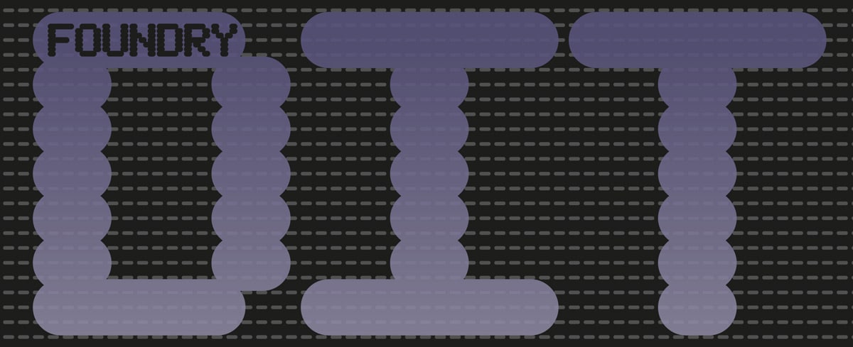
About Foundry Dit
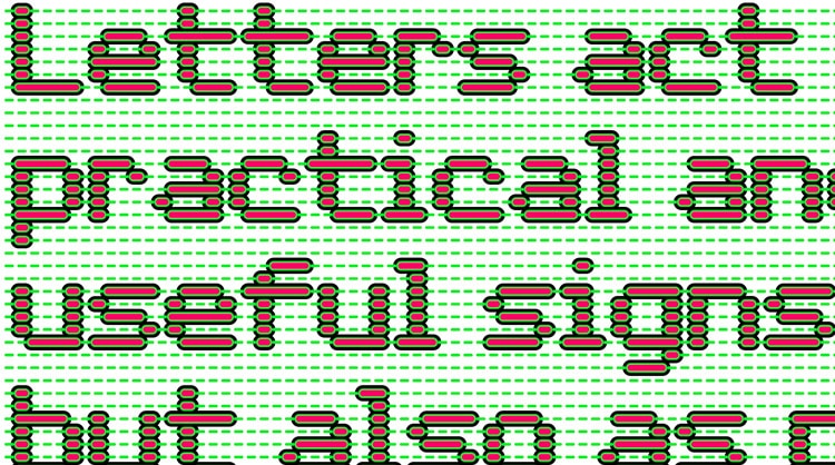
Both Foundry Dit and Dat families are fonts based on the same concept of an integral dot matrix grid system as Foundry Plek and Flek; Foundry Dat differs in that it also has this same grid matrix in the background of the letters. Foundry Dit has the exact same essential letterforms and also works as a correspondence font with a ‘typewriter font’ effect.
With an oblong, lozenge shape Foundry Dit and Dat appears soft, padded, and has been created with a common horizontal dash grid structure for precise layering when characters are superimposed. Dat’s integrated background aligns vertically and horizontally when set solid, forming a continuous pattern. The characters can also be offset to make compositional shapes – in the process becoming images – a graphic language with total integration of form and function. Dit functions as a legible correspondence font, with a ‘typewriter’ feel.
Like Foundry Plek and Flek, the 5 x 9 grid system allows the lozenge shapes to vary in size but still adhere strictly to the grid so that you can maneuver one text box exactly over each other to build up various patterns and colour schemes. The name Dit and Dat came from an off-the-cuff remark David made in response to Foundry Plek and Flek as to what we should name the new font. Dit and Dat, (This and That in Dutch).
Foundry Dit and Dat families include: Light, Regular, Medium and Bold weights – with the addition of a series of dashes to extend the grid vertically and horizontally. These two font families allow you to explore a whole new graphic language that can be developed, create, and play with.
Foundry Dat can be viewed here.
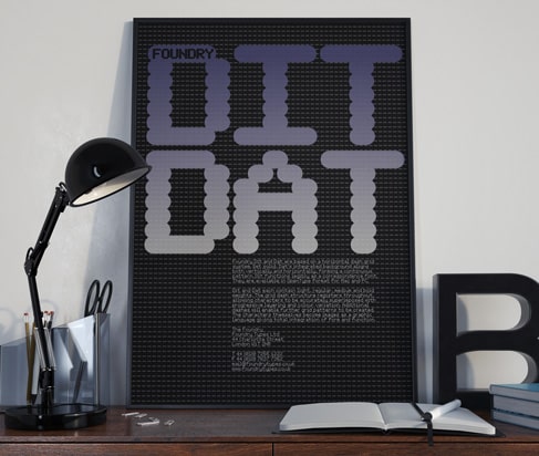
Foundry Dit and Dat poster.
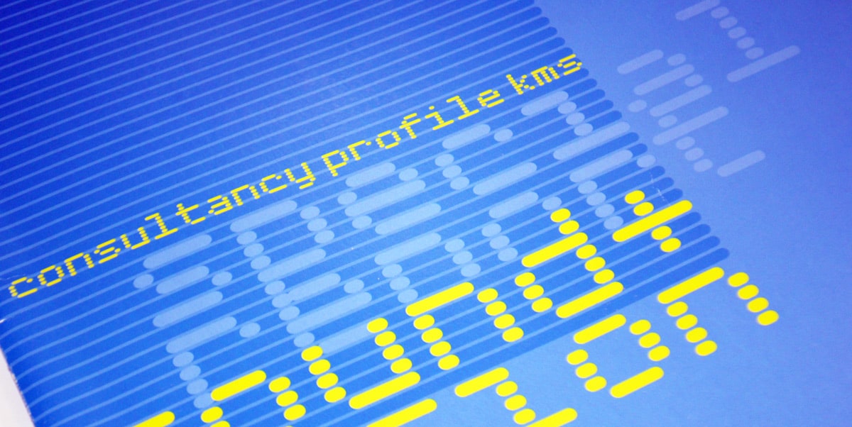
Foundry Dit and Dat, Graphics International 103, Feb 2003, front cover.
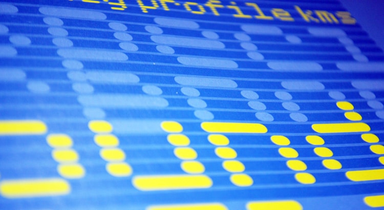
Foundry Dit and Dat sample.
Foundry Dit and Dat sample.
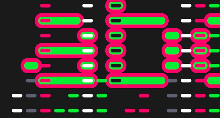
Foundry Dit and Dat, Grafik 146, Nov 2006, p.84.
Licence Foundry Dit through Monotype
The original Foundry font collection is currently available exclusively from Monotype, you can purchase a licence to use these typefaces at Fonts.com, FontShop, Linotype, and MyFonts, via the following links.