4 styles
Tester
Weights


Glyphs
Languages
Abenaki, Afaan Oromo, Afar, Afrikaans, Albanian, Alsatian, Amis, Anuta, Aragonese, Aranese, Arrernte, Arvanitic, Asturian, Aymara, Basque, Bikol, Bislama, Breton, Cape Verdean, Catalan, Cebuano, Chamorro, Chavacano, Chickasaw, Cofan, Corsican, Danish, Dawan, Delaware, Dholuo, Drehu, Dutch, English, Estonian, Faroese, Fijian, Filipino, Finnish, Folkspraak, French, Frisian, Friulian, Galician, Genoese, German, Gooniyandi, Greenlandic, Guadeloupean, Gwichin, Haitian Creole, Han, Hiligaynon, Hopi, Icelandic, Ido, Ilocano, Indonesian, Interglossa, Interlingua, Irish, Italian, Jamaican, Javanese, Jerriais, Kala Lagaw Ya, Kapampangan, Kaqchikel, Kikongo, Kinyarwanda, Kiribati, Kirundi, Klingon, Latin, Latino Sine, Lojban, Lombard, Low Saxon, Luxembourgish, Makhuwa, Malay, Manx, Marquesan, Meriam Mir, Mohawk, Montagnais, Murrinhpatha, Nagamese Creole, Ndebele, Neapolitan, Ngiyambaa, Norwegian, Novial, Occidental, Occitan, Oshiwambo, Palauan, Papiamento, Piedmontese, Portuguese, Potawatomi, Qeqchi, Quechua, Rarotongan, Romansh, Rotokas, Sami Southern, Samoan, Sango, Saramaccan, Sardinian, Scottish Gaelic, Seri, Seychellois, Shawnee, Shona, Sicilian, Slovio, Somali, Sotho Northern, Sotho Southern, Spanish, Sranan, Sundanese, Swahili, Swazi, Swedish, Tagalog, Tetum, Tok Pisin, Tokelauan, Tshiluba, Tsonga, Tswana, Tumbuka, Tzotzil, Ukrainian, Uzbek, Venetian, Volapuk, Voro, Walloon, Waraywaray, Warlpiri, Wayuu, Wikmungkan, Wiradjuri, Xhosa, Yapese, Yindjibarndi, Zapotec, Zulu, Zuni
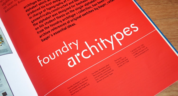
About Architype Renner
Architype Renner, one of the first typefaces to be revived by The Foundry under the ‘Architype One’ series in 1997. Recreating the experimental, geometric glyphs which Paul Renner drew for the Futura typeface family, alongside letterforms that were never originally released by the Bauer Foundry in 1927–30.
Renner began working on Futura in 1924; his start point and the basis for the design, being classical Roman inscriptional capitals. The task then was to make a harmonious marriage between capitals and lowercase. Circular shapes, pure forms and simplistic principles, make up the visionary elements of Renner’s sans serif, tempered by optical correction to follow earlier typeface proportions. Still retaining the spirit of the New Typography. Although Renner himself described Futura as, ‘Die Schrift unserer Zeit’ [the typeface of our time], I am sure that he would be both gratified and amazed that Futura still holds its ground; as a typeface it is one of the outstanding achievements of early modernism.
With minimal contrast between the thick and thin strokes, the optically efficient letterforms show a subtle construction, this is the hallmark and timeless quality of Futura. According to Robert Bringhurst – ‘Geometric as it is, Futura is one of the most rhythmical san serifs ever made. Its classical proportions are graceful and humane – closer to those of Centaur in the vertical dimensions’.
The Architype Renner family comes in four styles, Regular, Medium, Demi and Bold. This family features the old style figures and the experimental alternatives that Renner intended for initial release – the pure geometric form and sharp details make Futura and Renner one of the twentieth centuries most prominent and iconic typefaces.
Futura Medium at proofing stage, 1927.
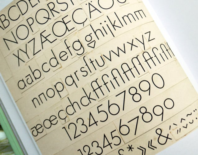
Futura Light at proofing stage, 1927.
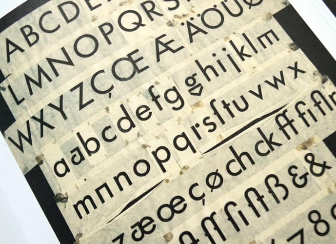
Early drawing of Futura, 1924.
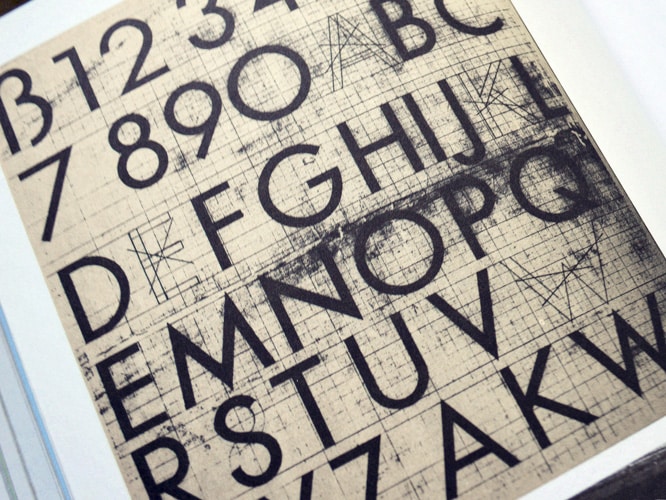
Uppercase Futura on graph paper.
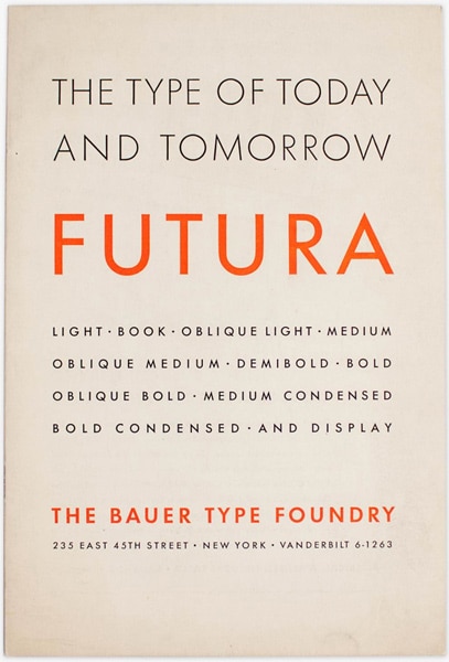
Futura specimen of issued by The Bauer Type Foundry.
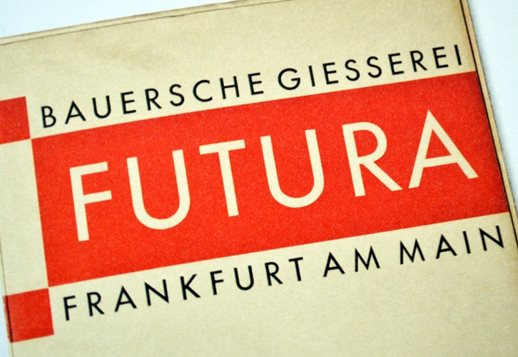
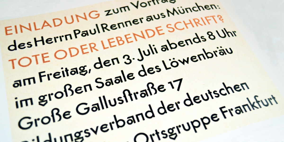
Futura, The Bauer Type Foundry, Frankfurt am Main, 1927.
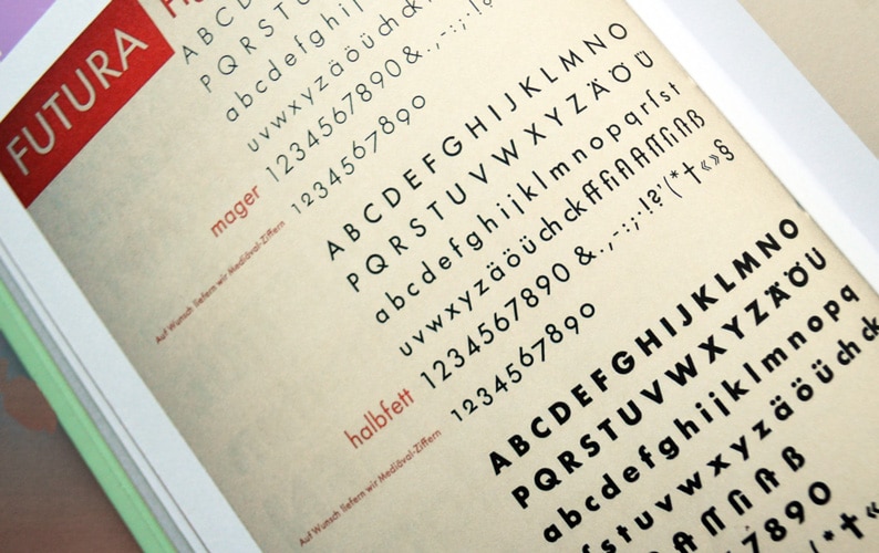
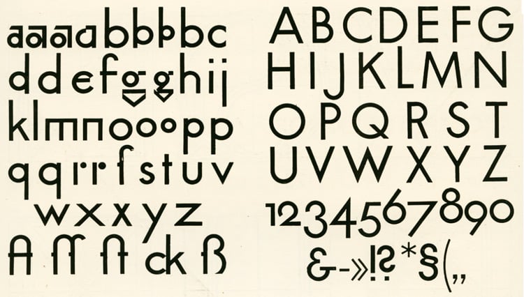
Futura type specimen showing Light, Medium and Bold, 1930.
Architype Renner, Graphics International 92, Feb 2002, p29.
Licence Architype Renner through Monotype
The original Foundry font collection is currently available exclusively from Monotype, you can purchase a licence to use these typefaces at Fonts.com, FontShop, Linotype, and MyFonts, via the following links.