Codex 3: The Journal of Letterforms / Summer 2013. Part 1 of 3
Freda Sack. Certainty through craft: a career in type design, from cutting to computing by Catherine Dixon.
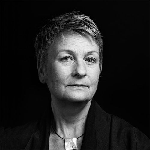
Freda Sack, Photo courtesy of Jason Wen © 2012.
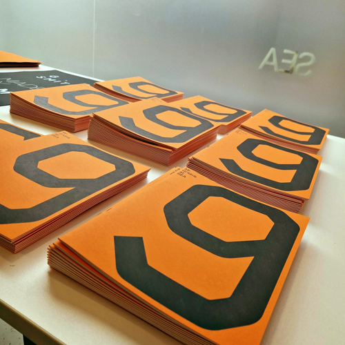
Freda Sack is a type designer, businesswoman, Board Director for the International Society of Typographic Designers (istd), lecturer, mentor, University governor—to name just some of her current roles. Her alphabets will be familiar to both designers and non-designers alike, with thousands having encountered her designs on the dry transfer sheets of Letraset, and many more familiar with her work through the role it has played in having given typographical shape to the commercial landscapes of the United Kingdom and beyond.
Her curve cutting skills are the stuff of industry legend, and she has done much by way of nurturing awareness of the value of such skills amongst a subsequent generation of designers through collaboration, training or straightforward enthusiasm, not least Jason Smith (FontSmith) and Henrik Kubel (A2-Type). She has also done much to promote design through the organization of lectures and exhibitions, becoming a catalyst for the celebrated Wim Crouwel show at the Design Museum in London (2011).
She has also been a keen protoganist in the promotion of educational events and programs abroad, participating in the first design conference held in Karachi, Pakistan and for many years working with the istd in South Africa. Yet her achievements are thinly documented and her own lectures are the exception, not the rule. So it was a pleasure to be able to invite Freda to reflect on her career, which has so ably spanned technologies and change, and bring her perspective to the ongoing discussion of what it is to design a typeface.
Catherine Dixon: You trained at Maidstone College of Art (1969–72) in graphic design and typography. When did you first start to realize that you were more interested in the forming of typefaces, than simply in their use? And how were you able to turn that interest into a career opportunity? I am imagining that the role of type designer would not have been so obvious a one to pursue in the early 1970s, and perhaps even less so being a female student.
Freda Sack: I didn’t really choose a career in typography or in type design. I just fell into it. I was eighteen, one year into the sixth form, and interested in literature and art. Calligraphy was one of the strands that fascinated me—well, all sorts of lettering shapes—but I didn’t have a clue about typefaces. Perhaps there was a subconscious ‘type’ infiltration through being a voracious reader! My education had been somewhat haphazard, having attended many different schools due to the family relocating many times with my father’s work. Faced with another move we all decided it would be difficult for me to go to yet another school. Someone suggested Maidstone College of Art in Kent and I applied to the School of Printing, which accepted just twelve students in a year, and they took me! It came as quite a revelation that there were such things as fonts/typefaces, or even different kinds. That was the real beginning. I enjoyed the practical approach of working with metal type, bookbinding, photography, etching, lithography, etc. It was a very craft-based course. I also found the history of printing interesting and inspiring. The incunabula period was fascinating, with my first real influence being the beauty of the typefaces of Francesco Griffo and their relationship to the printed texts of Aldus Manutius.
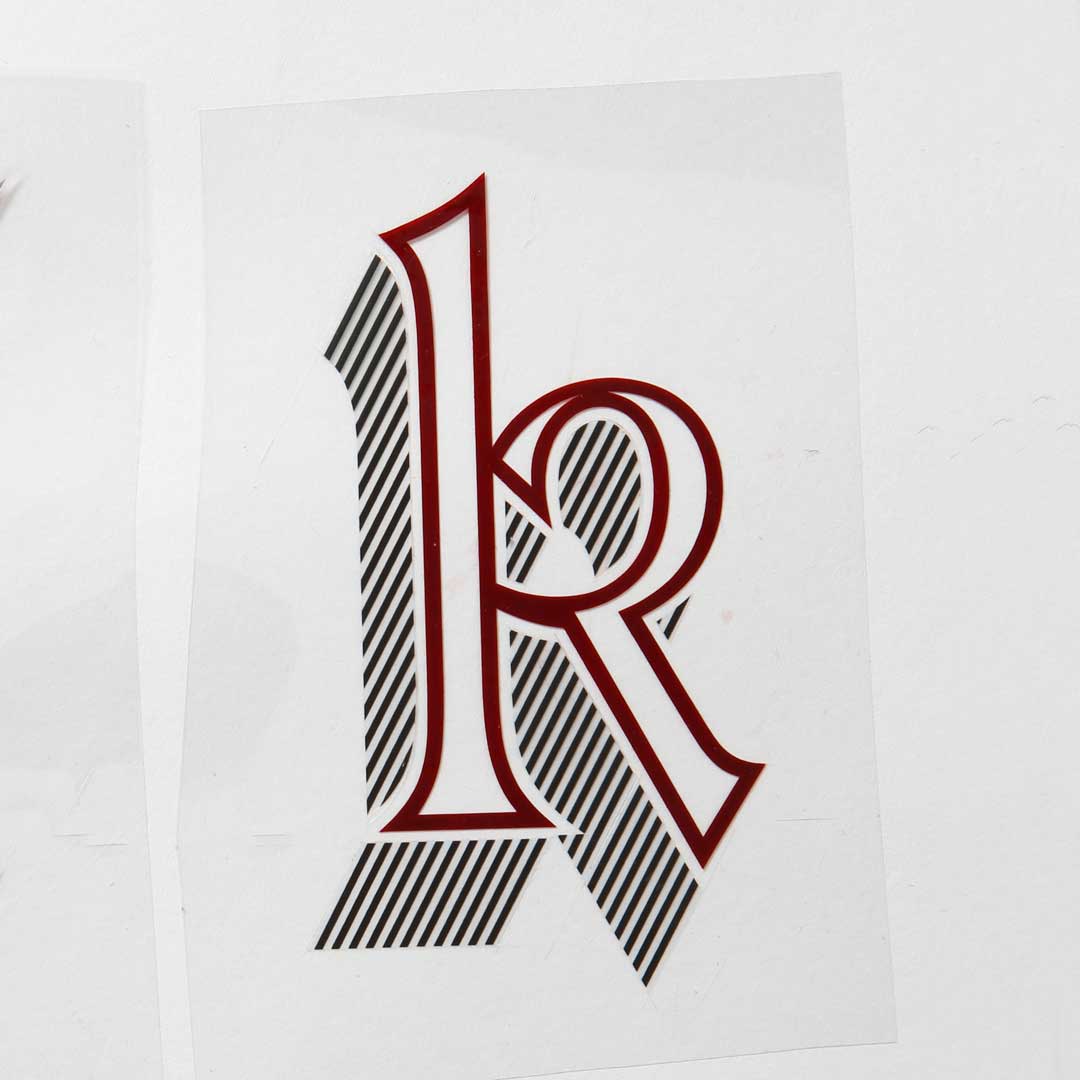
Freda’s rubylith cut of Letraset Talisman lowercase ‘k’.
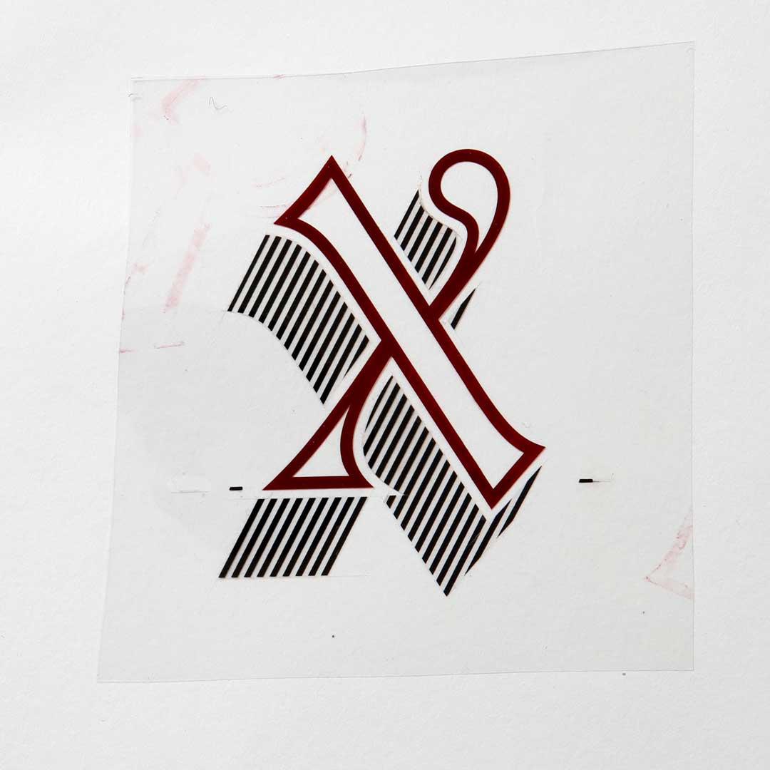
Freda’s rubylith cut of Letraset Talisman lowercase ‘x’.
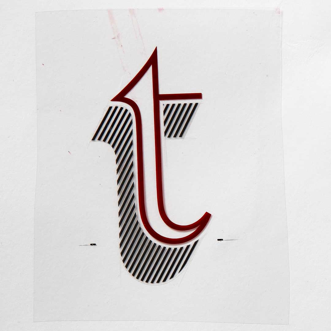
Freda’s rubylith cut of Letraset Talisman lowercase ‘t’.
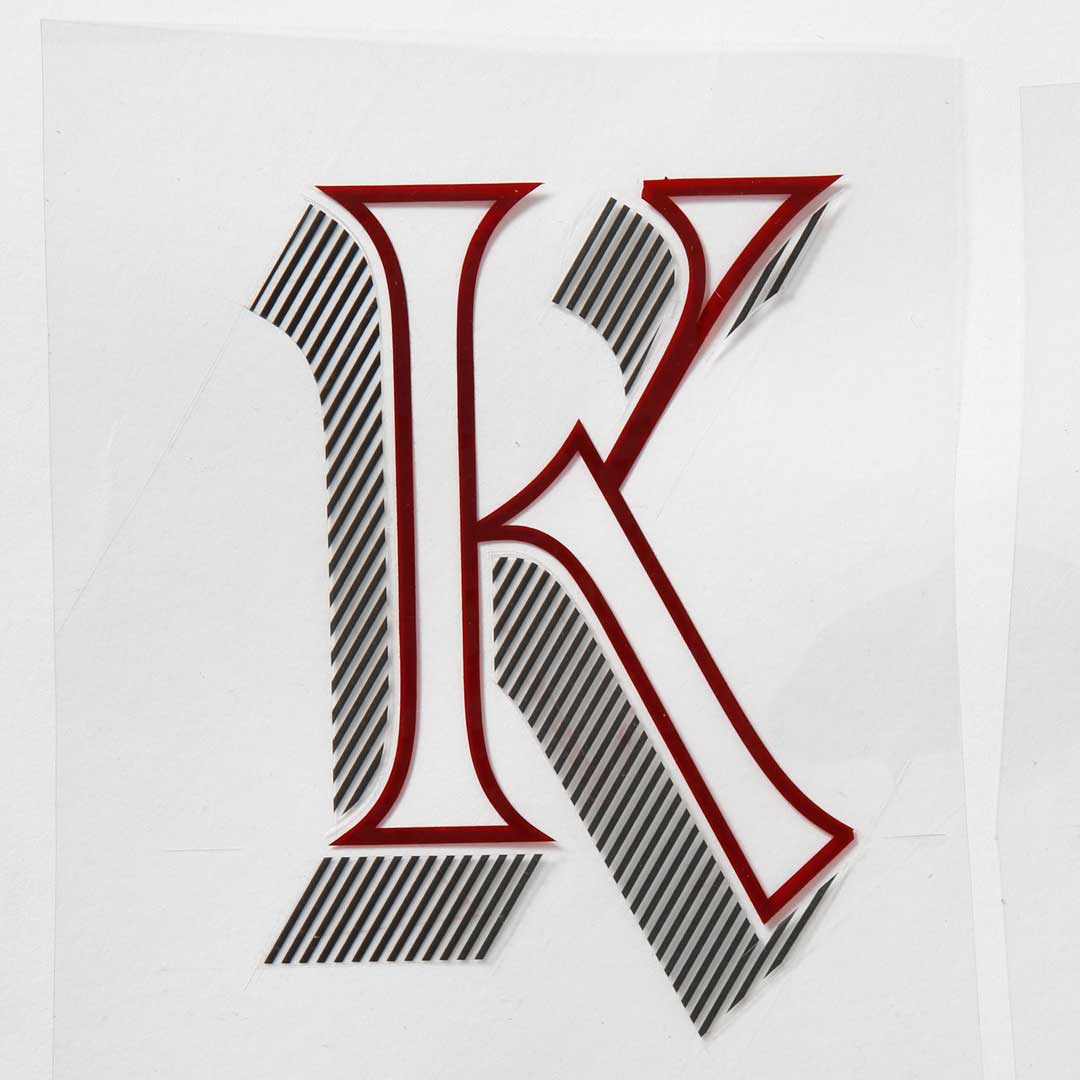
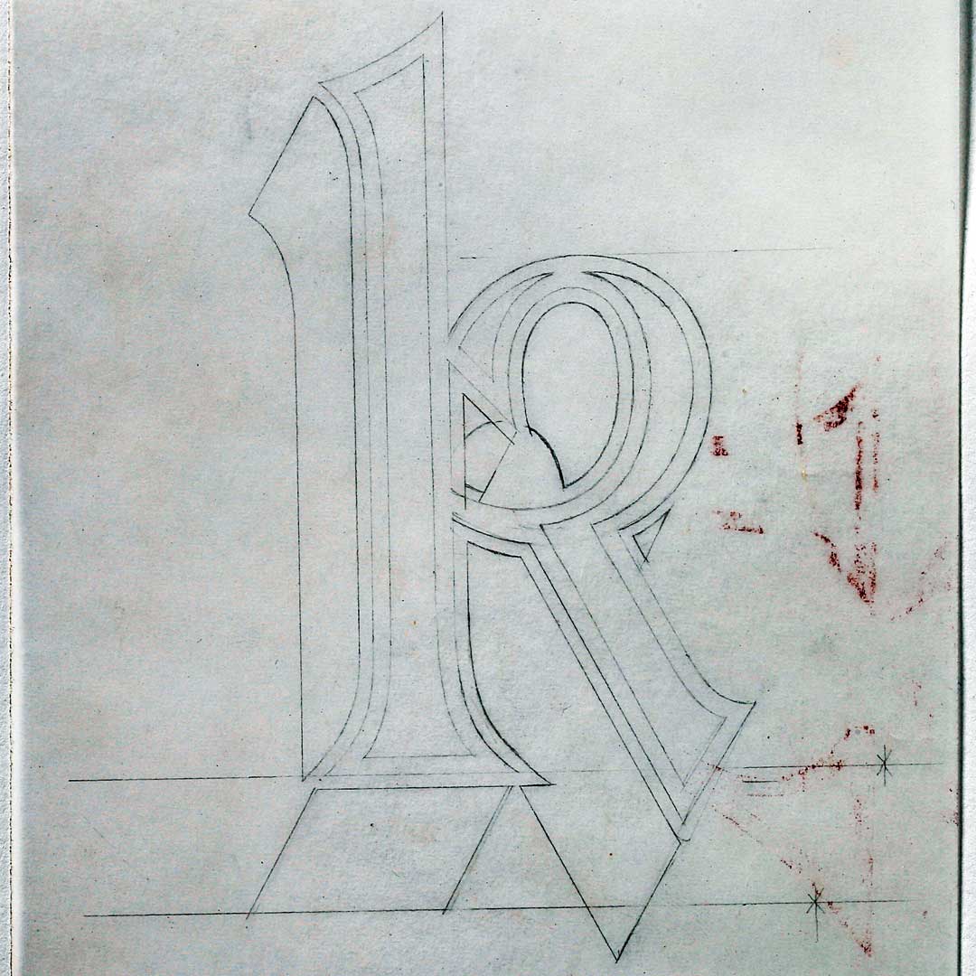
Freda’s rubylith cut of Letraset Talisman capital ‘K’.
Letraset was a local company and somehow I managed to get an interview with Mike Daines, manager of the type studio based at the factory in Ashford, Kent. The print trade was then still operating as a closed shop, employing only union members. Working in the photographic studio (1972–73) ruining my eyesight retouching for several months earned me entry to the union, after which I was finally able to graduate into the type studio (1973–75 trainee type designer/stencil cutter; 1975–78 type designer/ stencil cutter).
I have never considered working with type as being particularly unusual for a female. In fact, I was asked about this in an interview last year, and that surprised me; to be honest, it annoys me. I’ve always just got on and done my job. I enjoy it and I’m good at it. The School of Printing was quite male oriented, being full of print apprentices working towards their City & Guilds qualifications, but we had to do that as well. Of the twelve of us in my year there were five females, so although they probably thought we were unusual, once the novelty wore off and they saw we were just as seriously ‘getting on with it,’ there was no issue.
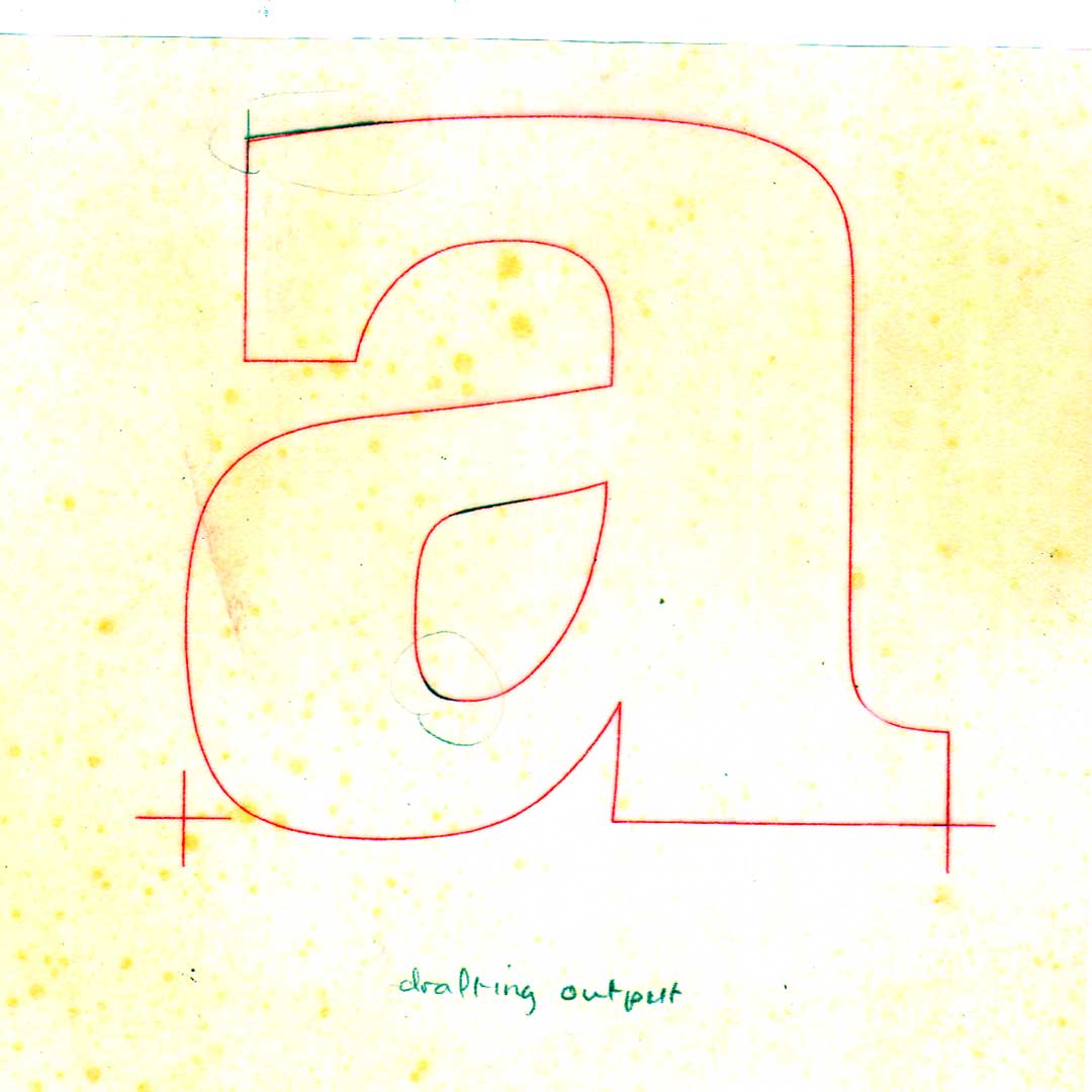
A draft of the Proteus lowercase ‘a’.
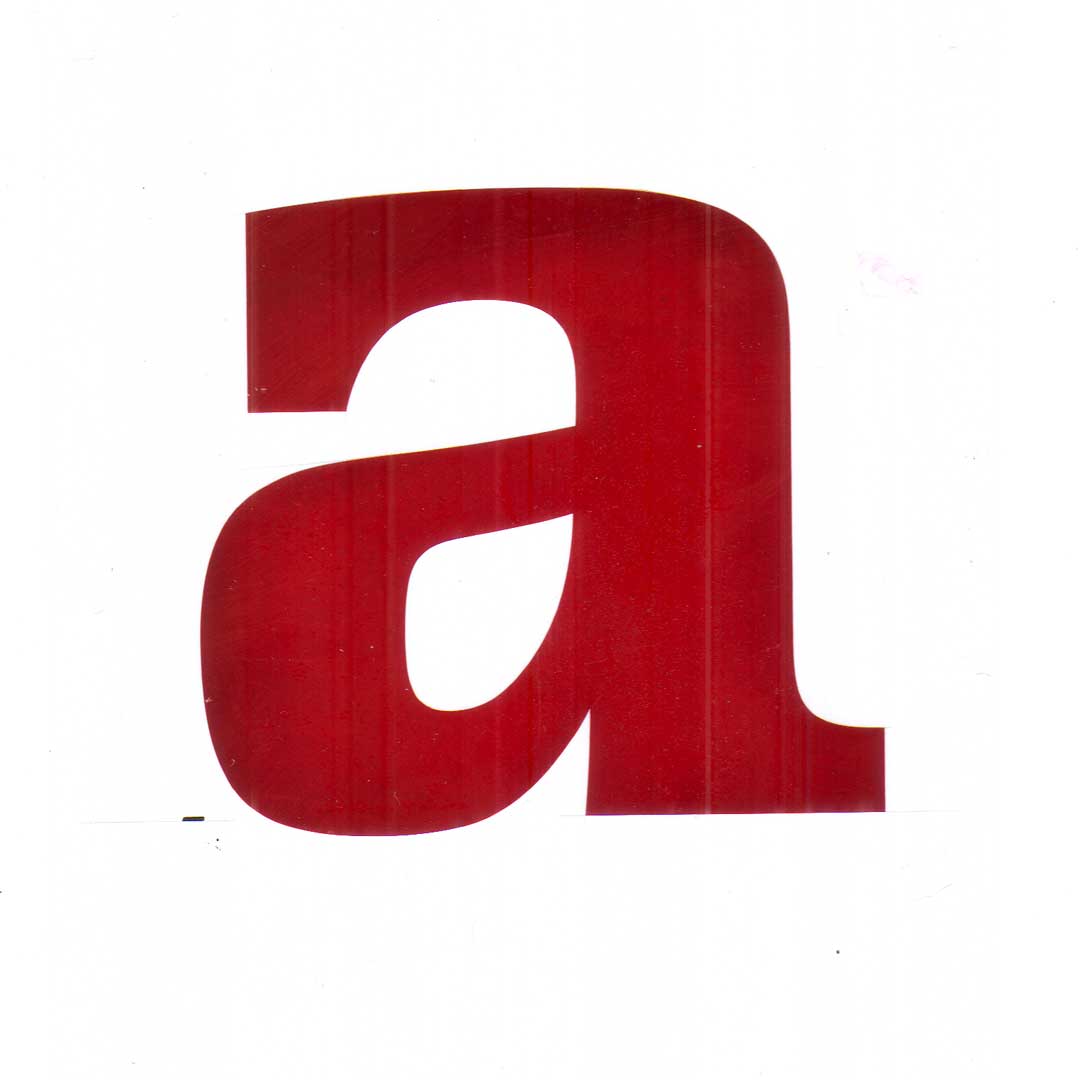
An edited version of the Proteus lowercase ‘a’ in rubyith.
Dixon: Letraset has often been seen as gimmicky, as being something of a joker in the field of typeface manufacture. Yet, its design processes were incredibly rigorous technically, offering what you and others have acknowledged as a singularly robust training in the management of typeforms, not least through the particular skill of stencil cutting. What did that involve?
Sack: At one time use of Letraset was the industry standard for creating artwork with an amazing array of typefaces for professional use. Though people would also actually rub down the spacing bars and leave them under the lettering, maybe hence not too serious a reputation. Essentially though, everything about the process of creating typefaces was very serious, and many well-known designers —Derek Birdsall, Aaron Burns, Alan Dempsey, Roger Excoffon, Armin Hofmann, Fred Lambert, Herb Lubalin, and Marcello Minale, to name just a few— were associated with Letraset, particularly when they launched the Letragraphica range in 1969.
It was in the Ashford studio that I really started to learn about typefaces. We drew and created artwork for all the classics of type design, working from often poor-quality photographic enlargements of hot metal type proofs. As novices, we all had to practice our skills on Garamond and Helvetica. Other typefaces included Caslon, Plantin, Palatino, Garamond Italic, Commercial Script, Jenson; a range of ’20s/ ’30s Stephenson Blake faces, 1970s itc faces such as American Typewriter, Lubalin Graph, and Souvenir; and Deberny & Peignot faces. And then, of course, there were the over-the-top and crazy faces as well—it was the ’70s! There are simply too many of these to list, but I did work on a number of the winning designs from the international typeface design competition Letraset then held. Without exception, these designs required a great deal of work to bring them up to minimum character set and the required artwork quality. Some were extremely decorative, and needed to be cut at larger sizes to cope with the detail. Initial capitals like Magnificat (Friedrich Peter, 1975) and later Masquerade (Martin Wait, 1977) sometimes took two days to complete just one character!
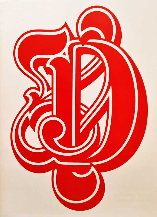
Freda’s handcut rubylith master for the initial capital D for Letraset Masquerade (Martin Wait, 1977).
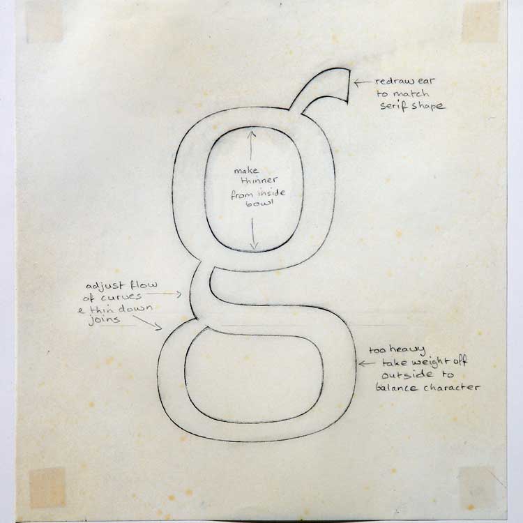
Having determined and measured all the different aspects and features of a given typeface, we would then make a ‘jig’ and draw the outlines. The jig was a kind of master pattern as a background grid that would incorporate all the essential proportions and stresses as shapes and measurements for drawing up the caps, lower case, and numerals, including: cap, x-, descender and ascender heights; overhangs; stem, horizontal, and curve weights; if a serifed form, then the serif shape, weight, and length, and, where appropriate, the bracket join and baseline scallop; and if an italic, then the ambient angle, and angle differentials for the ascenders and descenders. These were first created as an accurate fine-line drawing on good quality tracing paper, and certain elements were cut to become templates for the repeated shapes. These provided a guide to follow in the creation of a reproduction master for each character. The Rubylith artwork for each master was cut freehand as a stencil, a process originating in silkscreen techniques.
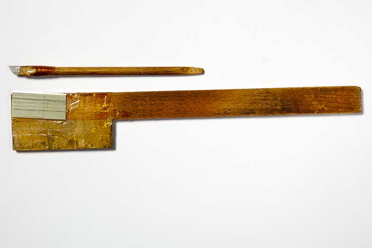
This work was meticulous, with accuracy being essential, though to see the unwieldy looking knives we used to cut the Rubylith artwork you might be forgiven for doubting the potential of this process. Working initially under the expert tutelage of mentor Bob Newman equipped me with the necessary manual skills. The first thing we had to do was make our own knife, which was essentially a long piece of wood with a piece of metal type as a counter balance at one end, and a single-edge razor blade taped to the side at an angle to enable the point to be manipulated freehand. Depending on whether you held the knife near to the blade end or at the far end of the handle would give a range of curves, from very tight to long, shallow sweeps—the knife being held relatively still, while the Rubylith itself was pivoted around by your other hand. It sounds crazy, but it worked. In fact, it was so accurate that to make a perfect shape I could trim off a sliver of Rubylith just the thickness of a hair, and that actually made a difference to a shape.
When starting in the studio we had to practice cutting circles freehand, and then to begin with we drew just the missing characters from otherwise fairly complete alphabets. Eventually we would graduate to ‘artworking’ entire typefaces—and then, much later, to designing new ones. We generally worked at six to eight inches cap height, although with more intricate designs we would work at a larger scale.
I later initiated a trial of cutting at four inches to try to see if it was possible to speed up the process and still retain the quality— which reduced by two weeks the usual six-week timescale to draw and cut one typeface, headline character set, one weight/style. We also had to hand space the characters before the artwork was made into the sets of photographic negatives and then positives needed to print the final transfer alphabet sheets. The space bars weren’t just for decoration; they provided a pretty good spacing system.
Dixon: In addition to the manual skills, any training in letterforms involves the training of the eyes. And your training must have been thorough. The sharpness of your eyes when assessing type has been recognized and made good use of through your participation in many design juries over the years. To quote your colleague David Quay, “Freda has the remarkable ability to look at any letter or alphabet and say immediately what is badly drawn or too heavy, too wide or narrow within half a gnat’s whisker! An uncanny skill I have never seen in another type designer.”
Sack: Analysis was key when artworking, and later designing, typefaces at Letraset. At the time I could probably have identified any typeface you put in front of me. I think this created an innate understanding of the proportions and structure of type. Analysis of the individual visual elements of a typeface and learning how they work together is an exercise in breaking down letterforms as structures, which, in turn, enables you to build back up—creating characters to fit in with an existing style, or to create new structures that become different styles/typefaces. For me then, it’s not just about having a sharpness of eye. That would only mean I might be able to see something was wrong, but wouldn’t necessarily know how to make it right. What is important is to have the understanding of the structure and proportions of the letterforms, and the ability to know when a curve or a shape is ‘wrong,’ and what is needed to correct it. This, I believe, is a direct result of an innate relationship with letterforms gained from analysis and then the physical process of creating them (hand/eye/ brain). The ‘right’ shapes become learned in the process. I think that’s why I tend to still hold a pencil when art directing, or even just talking about type—the tactile memory is important.
Part 1 of 3.
Special thanks to John Boardley (I Love Typography) and Catherine Dixon for their kind permission to republish this article.
Related articles