Codex 3: The Journal of Letterforms / Summer 2013. Part 2 of 3
Freda Sack. Certainty through craft: a career in type design, from cutting to computing by Catherine Dixon.
During the 1960s Letraset pioneered a method of stencil cutting as a means of achieving new levels of accuracy in the creation of the photographic reproduction masters needed for each character in a typeface. “Rubylith masking film, manufactured by the Ulano Corporation of New York, was the material chosen to create the stencil masters. Rubylith denotes the color, which is translucent red, and ideal for placing over drawings or artwork and trace-cutting, but essentially to use as a ‘line’ photographic negative or positive—the red reproduces as black, creating a reverse image. The material is composed of a gossamer-thin layer of red film attached by a light adhesive to a clear polyester base. Once the red surface film is cut, it can be peeled away with the adhesive remaining on the waste material, leaving a perfectly clear base and an edge definition second to none.” —From Dave Farey et al., Letraset & Stencil Cutting (New York and London: International Typeface Corporation and St. Bride Printing Library, 1996), pp. 5–6.
Dixon: The ability to draw, and to draw well, was clearly very important for a type designer then. As Colin Brignall, then Type Director at Letraset and responsible for art direction and font design/selection for the Letraset range, recalls from his early visits to the Ashford studio:
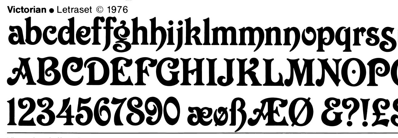
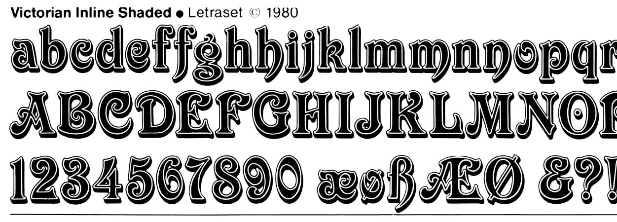
It was immediately apparent that Freda was a talented stencil cutter who had a great sense of curve and who could accurately interpret character shape/style from the roughest of originals. If my memory serves me well, the first typeface I had some influence with Freda was Victorian (1976). Letraset needed a face that represented the Victorian period and Freda redrew this from an old woodcut typeface, warts and all. Her drawings, using a 9h pencil onto a heavy grade tracing paper, were a work of art. She had not only captured the essence of the style but had really knocked it into shape in terms of color, style, balance, and accuracy. Such was the success of Victorian that it was decided to create an inline version with a drop shadow. A design task that required precision, especially to make sure the inline was a constant width. Freda’s patience, attention to detail, and her accuracy were much in evidence in the final art. Producing the missing incidental characters extended her skills into design.”
Is drawing still key for you?
Sack: Yes—so much so that I can’t think without a pencil in my hand. I still have a full-size drawing board—it was a prerequisite when we moved the studio two years ago that the board would be able to fit in the alcove behind my ‘conventional’ desk.
I do believe that you learn something from drawing that you can’t learn any other way. It also makes you see true shape— that is, to see shapes in their most accurate, uncompromising, and flowing forms rather than accepting a shape created on screen, which, dictated by the inadequacies of resolution or the way a shape is recreated through pixels or mathematical formulae, can never be as aesthetically accurate as a hand-drawn curve.
Dixon: The original transfer mechanism of Letraset limited the scope of the typeface library, with text faces not a priority for obvious reasons. Yet, as the Design Studio became the Letraset Digital Studio, the possibilities for expanding the Letraset range grew. And so you had to embrace the new digital technologies, bringing, I imagine, a whole new way of working and also a set of new demands in the origination of text faces. Those must have been exciting times to be working in, but also quite challenging?
Sack: Actually, I started to work more with text typefaces while still immersed very much in type design for ‘old technology,’ and not, at first, at Letraset at all. After six years or so of apprenticeship in the Ashford studio perfecting my hand and eye skills, I saw a job advert for a type designer in London [1978]. Nobody advertised then for type designers. Somehow I had the courage to apply, and found myself working with Adrian Williams at fonts/Hardy Williams Design in London, at first creating two-inch film fonts for photosetting; we later worked for many of the big type foundries, including Stempel, Berthold, and Linotype. Each foundry used different systems for creating typefaces that required different ways of artworking and spacing, and the greater emphasis there on text faces meant I was working on character sets that were far more extensive—as was the artwork, especially for Stempel, which took the form of large (approximately A3 in size) pieces of Rubylith called friskets, from which the letters themselves had to be cut out to provide a negative image. In other words, the background stayed and the letters were peeled out. This necessitated a new way of cutting, standing up most of the time so that the whole sheet could be swung round. The cutting line was also from the inside of the letter, so the curves were created differently. Not only that, but the characters were often cut in reverse. It was interesting, though, to learn about these sometimes vastly different manufacture processes. We were also commissioned to do artwork, and sometimes create branding typefaces, for example, for the [British] Post Office and Renault.
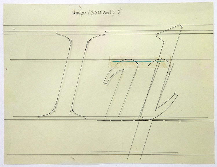
It was at this time that I also first had the opportunity to meet more people in the type industry, as we often had to visit the German and Swiss foundries we were working for. We also went to ATypI, which was then the industry annual conference, and often lavishly sponsored by a type manufacturer. My first ATypI was Munich in 1978, where I met Hermann Zapf, Max Miedinger, Mike Parker, Herb Lubalin, Matthew Carter, and Günter Gerhard Lange, amongst others. These were my type heroes! Zapf just because I liked the feel of his typeface designs; Lange for his approach and meticulousness. I was also lucky enough to work with him eventually on a couple of projects. I was lucky, too, to freelance for Matthew Carter working, among other things, on his Galliard typeface for Mergenthaler.
After a couple of years (1980) I was head-hunted (again by Mike Daines) back to Letraset, though this time to the TSI London studio. I knew the company and by then had gained additional experience with text fonts, and with my wider industry manufacturing experience I was perhaps seen as well suited for working with the beginnings of the use of digital technology at Letraset.
For this I trained on the Ikarus system with Veronika Elsner of URW [Unternehmensberatung Rubow Weber]. Ikarus was never a ‘type design’ system, rather a digital tool to mechanically render artwork for reproduction. Initially the system made use of a flatbed plotter to cut the Rubylith artwork, rather than using our hand cutting skills—although we still had to peel out the background film by hand to leave the letterform master. We would design and draw the typefaces as usual, using the Ikarus software via a hand cursor and command files to ‘translate’ the design into a digital carrier. This significantly reduced the time needed for the development of a typeface, with it being easier and quicker to create duplicate composite characters and, through the possibilities for interpolating and extrapolating, families of weights. Eventually the process became entirely digital (though still following hand-drawn designs), with the Rubylith stencil-cutting stage rendered obsolete.
The computer running the Ikarus software was the size of a small office. We worked on high resolution ‘green screens’ (Tektronix, I think), to begin with mostly alphanumerical editing from printouts of columns of figures. In the process of using the Ikarus system we had managed to incorporate some modifications to the digital process that were more in tune with our visual approach. I had personally gone to Hamburg to work with the developers there at URW to make the alphanumeric system, as far as possible, more visually intuitive and user-friendly for type designers. This system was later developed into the more familiar onscreen manipulation of curves, though still only by changing x- and y-coordinate values. It was indeed a painstaking process, though precision in the inputting process and in the markup of characters was key if the resultant character shapes were to accurately represent the original drawn designs.
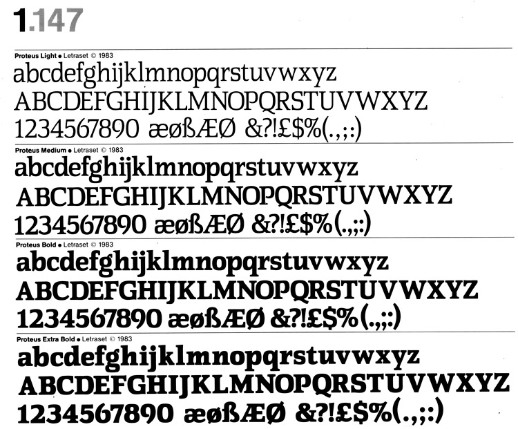
I think my first truly digital typeface was Proteus, which launched in 1983. Letraset fulfilled a dual role in developing existing typefaces and designing exclusive ones. I suppose that by designing new typefaces they could maximize the potential market in the digital arena, by making the fonts available to other film-setting systems such as Berthold, Compugraphic, Mergenthaler, and Stempel. Many type manufacturers produced both the typesetting machines and the fonts for them. Having an exclusive range of fonts could make a big market difference to them and their machine customers. Of the 1983 standard range improvement for Letraset, thirteen of the nineteen typefaces were new and exclusive to Letraset.
There was still a demand for headline typefaces of course, and Proteus was required to fulfill both roles—enough character to speak as a headline, but also neutral enough to work in text. The range of weights reflected this, with the bolder weights clearly aimed at headline. Developing for both text and headline use posed certain design constraints, such as maximum legibility at small sizes, where counter shape, x-height, and serif shape are all important. Initial work was done by hand drawing, and overall I wanted to achieve a soft squarish shape and a large x-height to get the most from the counters with deep cut-ins that would be good for small sizes, and allow space for heavier thin strokes with the bolder weights; to create well-defined, almost rectangular word shapes; and yes, I did also hand-cut some test words. It was quicker than the machine for this stage. The shape was softer in the lighter weights, and squarer in the bolder weights.
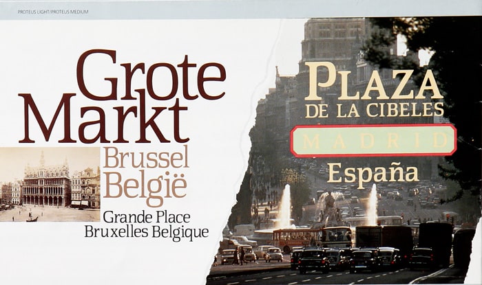
After test words were deemed satisfactory, two weights of Proteus were drawn, a regular and a bold, which were input as the basis for a family of interpolated weights. With ikarus we were able to check small size suitability at an early stage. With a flexible range of weights, the lighter weights had a classical roman pedigree, and the bold weights tended more to the Egyptian slab serif look.
The name Proteus was appropriate. Initially I just liked the sound and form of it, but when I looked it up it turned out that it was the name of a character in Greek mythology who had the ability to change shape—the keeper of Neptune’s seals on the island of Pharos off the Egyptian coast. It occurred to me that this changeability was exactly what was happening with the gradual creation of this typeface and the Greco/Egyptian connection wasn’t lost on me with the form of the design. Serendipity . . .
Dixon: You left the Letraset group to set up by yourself in 1983. From your time working with type designer Adrian Williams, I guess you had some earlier experience of working with custom type design, though setting up alone seems to be the moment when you really started to make your own mark in the corporate design world. And not just in the uk either. Erik Spiekermann commissioned you to supply Ulano Rubylith artwork for the newly formed Meta Design in Berlin. Here is what he has said about working with you:
Freda had done quite a bit of work for me while I worked for Wolff Olins, so that I trusted her and she knew what I needed. There also wasn’t anybody in Germany using that technique which was very unique, invented and perfected by the people in the Letraset studio. At Berthold, who I also worked for, they drew pen and ink, then transferred those drawings to white photographic film and then proceeded to scrape that film along railway [French] curves. That created a very clean edge as well, but got different curves. The method of cutting with a razor blade attached to a bit of wood, as practiced at Letraset, made the curves more fluent and generous, whereas the Berthold curves tended to be more controlled, dare I say Teutonic. If you wanted precision, you went the Berthold way. If you wanted a slight interpretation, you had someone from London cut Ulano.
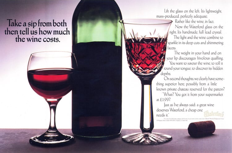
Sack: I can’t recall when I first met Erik. He was a consultant for TSI, though he also worked for a company called Film Composition at one point, near the Letraset London studio. I think my meticulous artwork appealed to his sense of precision, but he was equally fun to work for. Railway curves were sets of French curves used by a number of type manufacturers, and they had a whole range of sizes with tight to long curves to call upon. I always thought it a rather disjointed and time consuming way of working, and despite Erik’s comments I think less precise, as the mechanical curves dictated the end result, not the visual judgment. He is right, though, that hand cutting allowed you the ability to interpret as you went, but usually this helped if you didn’t have a particularly good reference to work from, so one could, if skilled enough, literally join up the dots as you cut. The challenge of work in those early days was the deadlines. Agencies in particular (consultancies less so) needed a very quick turnaround, often as little as three days. I developed my own way of dealing with this, producing very small drawings and cuts, but still accurate. I produced all sorts of quirky typefaces for a number of highly skilled/talented typographers/art directors, e.g. Len Cheeseman of advertising agency Collett Dickenson Pearce (CDP); an elaborate shaded shadow font for a McDougalls flour campaign; a ‘cut glass’ style for Waterford Crystal, and many more. I continued to work on typefaces for Cheeseman when he relocated to New Zealand, including one for the New Zealand Post Office.
Dixon: You also had the opportunity to collaborate with type designer Shelley Winter and the type designer and writer Walter Tracy, who for many years had been in charge of typeface development for Linotype, England, and who was by then a consultant for Letraset on non-Latin typefaces. How was he to work with?
Sack: I think Shelley and I met at ATypI. We had a similar, dedicated attitude to the work. She had very focused ideas about what we needed to achieve and the process of the work, and I respected that. I also enjoyed the experience of working for newspaper design. The new headline typeface for the Daily Telegraph was the largest project I worked on with her, and the typeface design was very much Shelley’s vision and concept, with her art directing me. The result was Telegraph Newface Roman (1990), which followed the bold weight (1989) produced by Shelley working with Walter. She obviously knew Walter much better than I did, not least because of the Linotype link. He was of course very knowledgeable and a true gentleman, it was a privilege to even be acquainted with him.
In addition to working on non-Latins with Walter for the Letraset range, I had often worked on such typefaces while at fonts, working especially on the development of Greek and Cyrillic alphabets for Linotype. I also produced some Greek frisket artwork for Matthew Carter. The design of non-Latin typefaces all comes down to analysis of the correct classical sources, the writing systems, and the culture. This needs to be combined with an understanding of what you can and can’t do with non-Latin letterforms. They are often not as flexible as our Latin forms, which you can stretch, distort, elaborate upon—and still they are recognizable.
The final part 3 of this interview will be available next week.
Special thanks to John Boardley (I Love Typography) and Catherine Dixon for their kind permission to republish this article.
Related articles