Codex 3: The Journal of Letterforms / Summer 2013. Part 3 of 3
Freda Sack. Certainty through craft: a career in type design, from cutting to computing by Catherine Dixon.
Dixon: Many people will perhaps be most familiar with your work as a result of your collaboration with David Quay and the exclusive font library you started together as The Foundry in 1990. What were your ambitions for this new library when you began? And how were you producing typefaces? It was still early days for the Macintosh—was designing fonts on a Mac even a possibility in London then?
Sack: David and I met through Letraset (when I rejoined in London, although we had briefly crossed paths when I worked at Fonts). He had been asked by Colin Brignall to submit some of the letterforms he had created for book jackets to be developed into typefaces. David wasn’t a typeface designer; he was a designer, and an extremely good lettering artist, which is different. Making a few letters work together as a word, or logotype, however elaborate, is not the same as making an entire set of letterforms work together in whatever combination. It was often my job in the Letraset studio to take his drawings and finesse and artwork them into whole typefaces—for example, Quay Roman (1985; based on Goudy’s Forum Titling of 1911), Santa Fe (1983), Titus (1984), and Vegas (1984). I think the process fascinated him.
When I left Letraset to work freelance I did a lot of work for David, and then we began to work together when he was asked to create a typeface (Helicon, 1989) for Berthold. We spent much time on the telephone discussing minor letterform changes, and decided it would make more sense to work together in the same studio, which was in the Archer Street workshops, Soho—a hotbed of creativity. The Why Not boys had the studio above and below ours, and Johnny Barnbrook also moved in. There were also some good photographers and architects, not to mention the bed-shows, strippers, and ‘working girls’ that made up most of the rest of the street’s residents.
It was a very exciting time, those early days of the Mac in design. David bought his first Mac, a squarish grey box, to do a small identity job but we were always tapping the Why Nots for tips. The advent of the Mac brought the possibility of setting up our own type foundry. No longer did we have to submit designs to other type manufacturers for them to release; both David and I had typefaces in the Letraset and ITC libraries, as well as with Linotype and Berthold. We never came to terms with their requirements for unsuitable extra bold weights and inappropriate italics—and although we were often paid for the drawings, the subsequent royalty systems earned us very little income. A version of the mainframe Ikarus system had been developed specifically for use on the Mac, which couldn’t have been more different from the unfriendly original software that had required a list of command files to operate and which crashed frequently. Instead Ikarus M (1989) was a revelation, as well as being an affordable technology, and it enabled us to become an independent foundry with absolute control over the typefaces we chose to create, and their family of weights.
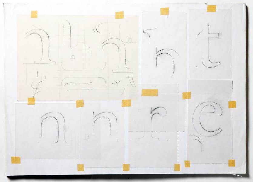
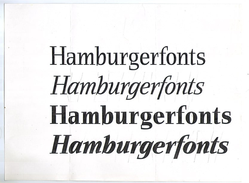
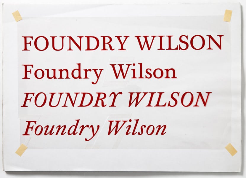
We still drew a lot—it was natural for us. We had drawing boards side by side and we would work on the same drawings passing them back and forth between us. We both still start with sketches—we don’t draw on screen. We had, and still have, only a very small range, because we take a long time to develop our typefaces, and alongside of that we also do corporate typefaces and logotype work. Even some of our earlier corporate typefaces were extensively hand drawn. The last Foundry typeface to be hand drawn was Foundry Wilson.
David and I worked together as partners for approximately ten years, though by the late 1990s David had become more involved in teaching, especially abroad. So, while we own The Foundry typeface library between us, to which we both add more typefaces, we are no longer business partners in the strictest sense. David lives in Amsterdam, running his own design company working mainly in typography, while I live and work in London with my company Foundry Types Ltd., developing and managing The Foundry library, and continuing to work on assorted typeface commissions.
Dixon: Your clear sense of history has had a role to play in your design output throughout your career, from your love of Griffo at college and your earliest commercial projects such as Victorian, through to later Letraset revivals—I’m thinking here of your work on projects such as the revival of Oldrich Menhart’s Figural type—and the development of typefaces such as Foundry Wilson and then, perhaps most strikingly, in the Architype series. Could you talk us through the strategies at work with these different ‘revival’ projects, and perhaps where you see the value of history in relation to the business of designing type in the twenty-first century?
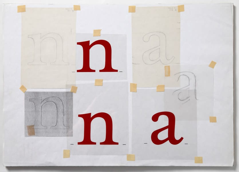
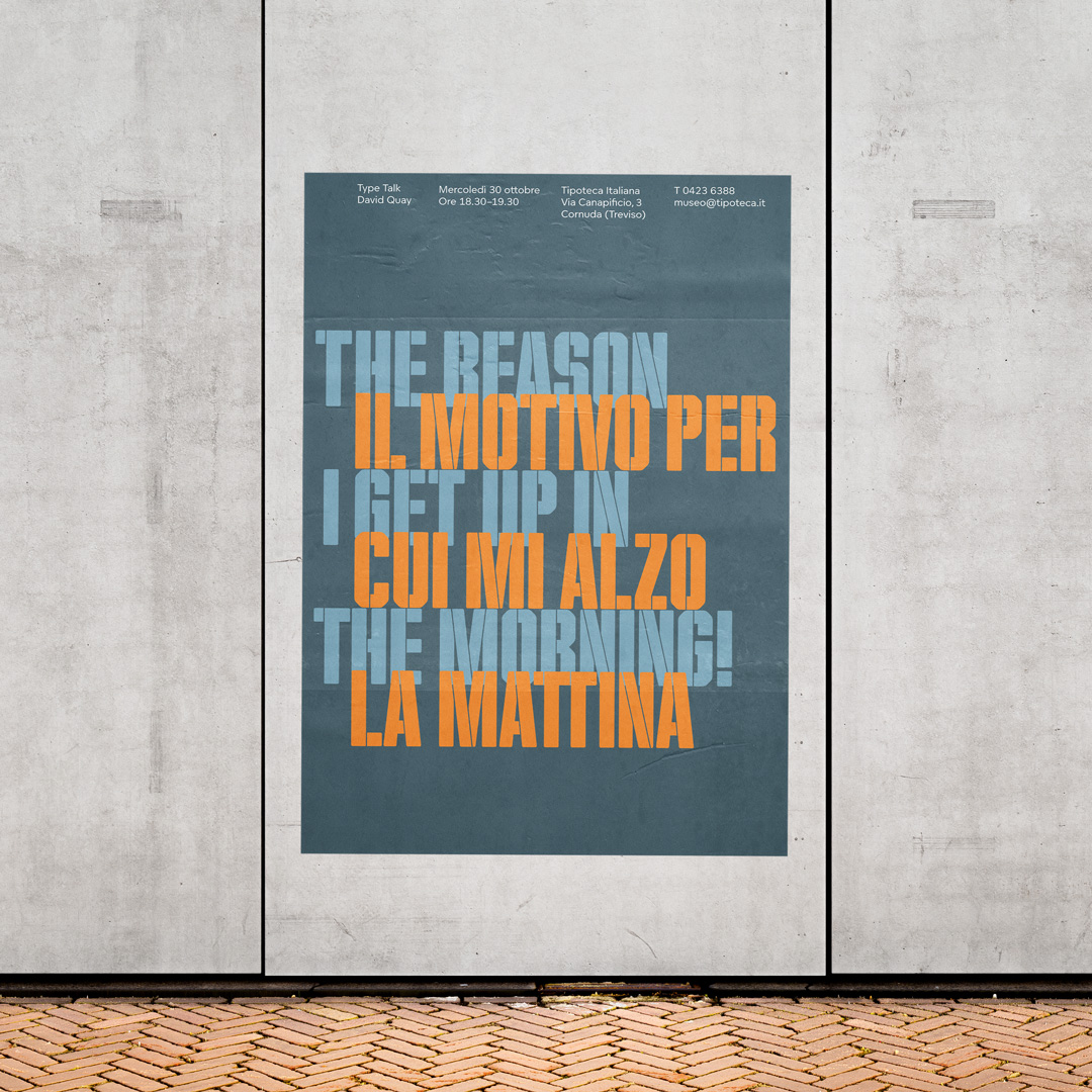
Sack: Figural was a commission from Letraset. Although I drew the original weight and its italic, and possibly a bold weight, either just before I left Letraset or as a freelance project for them shortly after, it was subsequently developed from my originals into an entire text family by Michael Gills in the Letraset studio [see the feature section of Codex 2]. Foundry Wilson started off as a commission from ITC, which they subsequently decided they didn’t want to release, but which was absolutely fine by us. We had enjoyed the research on the revival and the drawing and development of the four-weight family, and the printers’ flowers. It is one of my favorite typefaces, and its recent reworking and development as an OpenType format font has proved its pedigree. We are not great supporters of reviving typefaces, particularly if they have been available for use before—there are ethical issues involved, and generally we work purely on original concepts.
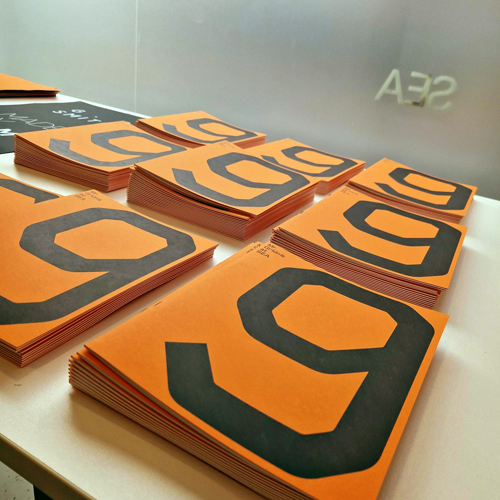
The Architype Collections for the most part were revivals of letterforms, rather than actual typefaces, as they either didn’t exist as typefaces at all (only as a few letterforms made for a poster, for example) or they were not available for general use, and/or didn’t exist as fonts. The Architype Collections came about simply because it was suggested that we might do some headline typefaces—we didn’t really want to go down that route, as we had had our fill of this for Letraset. However, we were persuaded that it was a good idea after deciding upon a theme that we both had a passion for—the Bauhaus in particular, but art movements from the ’20s to the ’40s more generally. It was also a bit of a debunk, as at the time there were quite a few typefaces around that ‘derived’ from people like Theo van Doesburg but nobody credited their sources. The original faces were seen to have been very groundbreaking, so we thought we would revive a few and credit the sources, thereby making it a kind of educational exercise at the same time. We had created rather lovely little white type specimen leaflets for Foundry Sans, Foundry Old Style, and Foundry Wilson, and with the Architypes we designed a poster that folded, with type specimen and contextual history provided all in one.
We later had the great privilege of working with Wim Crouwel on a number of his experimental alphabets, notably what became Foundry Gridnik, a new alphabet. He was flattered to have them re-created, and keen to have them as digital fonts so that he could use them himself on his newly acquired Mac. Note—we worked with him, and to his strict instructions, on how the typefaces should appear, and of course we credit him, and he receives royalties from us. This is a point that we think is extremely important to make. It irks us greatly that there are a few people out there who have produced unauthorized ‘clones,’ especially of Gridnik, which we regard as blatant plagiarism, and they earn money from the work of Crouwel, and he gets none of it. Not only is it wrong, it is totally disrespectful to Crouwel himself.
Dixon: Alongside the development of The Foundry type library, you were also busy with custom typeface design for what had grown into a serious suite of international corporate clients. Yet the corporate design world can be cruel with subsequent rebranding, rendering work all but invisible to a contemporary audience. If you could pick out just a couple of projects from the past you feel would be exemplary for a younger design audience now, what would they be and why?
Sack: Design of the typeface for the Yellow Pages business directory (1998) was a challenging and interesting project. We were commissioned by designer Michael Johnson of Johnson Banks—he’s great to work with, has a keen eye, and a wonderful appreciation of the power of a typeface. I often find that when you have strict parameters it makes you more creative. I certainly enjoy designing for very specific purposes. For that project we had to create a typeface that was readable, legible at very small sizes, and took up less space on the page to save paper. It was one of the few projects where we have been able to work to a schedule that included enough time and budget to have the necessary testing stages. Early on we tested beta fonts on the intended paper, printed at high speed to see how they survived. Then they printed a whole directory just for Northern Ireland that was circulated for real, though it fulfilled a trial function as well. We won a D&AD Silver award for our work. At the time, I think, it was only the second typeface to win such an award.
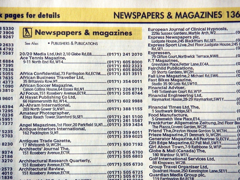
An example page of Yellow Pages before the redesign.
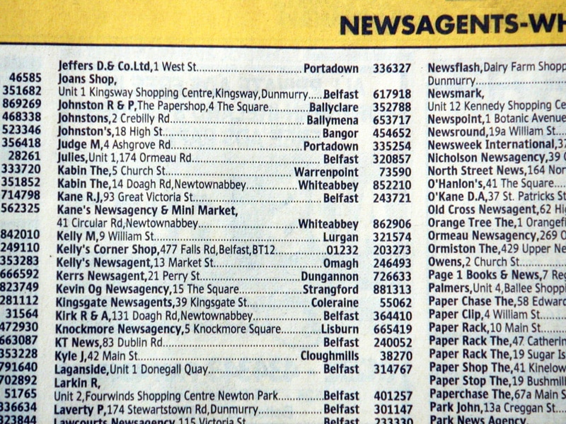
The new Yellow Pages font in a final printed example.
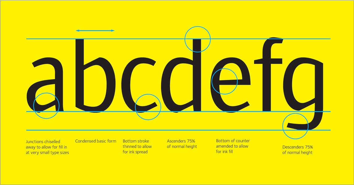
The new Yellow Pages font highlighting the new design features.
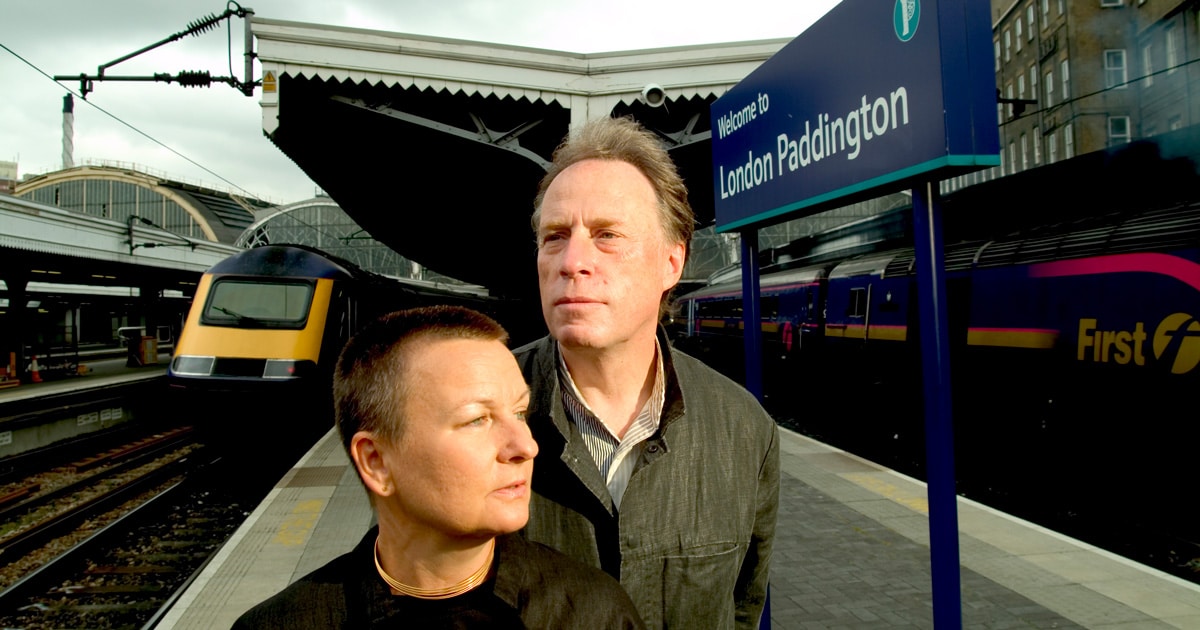
We seemed to get a run of transport projects. Working with consultancy Citigate Lloyd Northover we developed the typeface Brunel (1998). It was commissioned for use in mainline UK railway stations, and was a favorite project for me, again because of the strict parameters. For that project, though, we were, on the whole, designing for much larger use on signage, including some of the first plasma screens. It was a great brief. The typeface had to look English— although of course it is used all over the UK—and had to have authority. In addition to its basic information/directional functions, the type was also required to bring some visual consistency to station environments, countering the confusion of the prevalence of visual identities adopted by the various new train operating companies then being formed, and the visual noise of station concourse shopping.
Lisbon Metro (1995) was a fresh design needed for a similar context, though a different culture. This time the focus was a brand new metro line, with the typeface needing to encapsulate a modern energy, and be suitable for signage. The concept came from the metro ‘M’ emblem designed by Wolff Olins, combined with the curvy linear qualities of Portuguese mosaics. It was an interesting project owing to the prevalence of vowels in the Portuguese language, and the different accents, which gave a very different typographic color on the page.
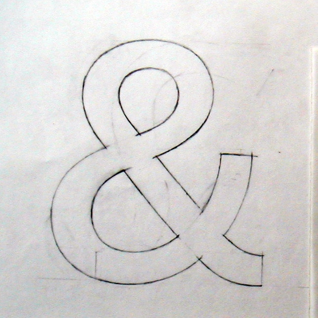
A pencil sketch of the ‘Ampersand’ for the Railtrack typeface ‘Brunel’.
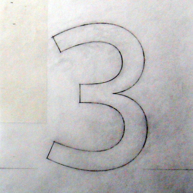
A pencil sketch of the ‘3’ for the Railtrack typeface ‘Brunel’.
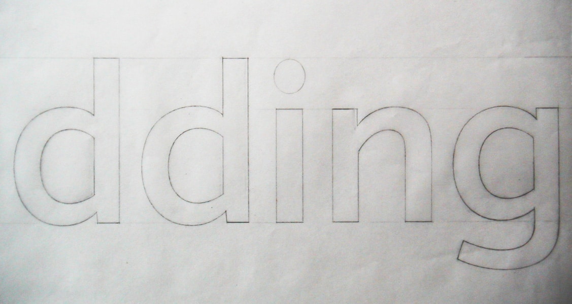
A pencil sketch of the ‘dding’ for the Railtrack typeface ‘Brunel’.
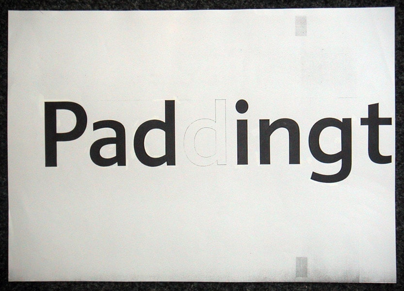
An inked in pencil sketch of the ‘Paddingt’ for the Railtrack typeface ‘Brunel’.
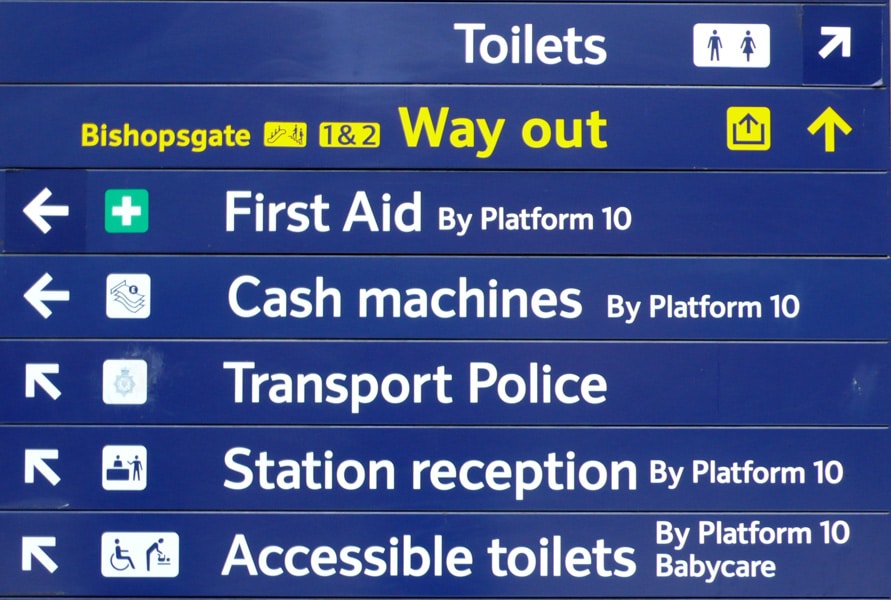
Signage test plate for the Railtrack typeface ‘Brunel’.
Dixon: Given the scope of your career, there has been a lot to talk about in terms of the past. Yet, the past doesn’t seem to be somewhere you especially dwell. You once said, “As a designer and as a teacher I’ve learnt that the only thing you can be sure about is change.”
Sack: How one deals with change makes the difference as to whether you enjoy life or not, embracing change and making that a positive experience. I’ve always been someone who is up for a challenge, and the ever-changing technology of type design requires not only creative ideas and skills, but also technical knowledge and ability. I also think it is requisite to be a good typographer in order to be a good type designer, and equally important to have a love of language. After all, that’s what it’s all about.
Special thanks to John Boardley (I Love Typography) and Catherine Dixon for their kind permission to republish this article.
Related articles