20 styles
Tester
Weights
Glyphs
Languages
Abenaki, Afaan Oromo, Afar, Afrikaans, Albanian, Alsatian, Amis, Anuta, Aragonese, Aranese, Aromanian, Arrernte, Arvanitic, Asturian, Atayal, Aymara, Bashkir, Basque, Belarusian, Bemba, Bikol, Bislama, Bosnian, Breton, Bulgarian Romanization, Cape Verdean, Catalan, Cebuano, Chamorro, Chavacano, Chichewa, Chickasaw, Cimbrian, Cofan, Corsican, Creek, Crimean Tatar, Croatian, Czech, Danish, Dawan, Delaware, Dholuo, Drehu, Dutch, English, Esperanto, Estonian, Faroese, Fijian, Filipino, Finnish, Folkspraak, French, Frisian, Friulian, Gagauz, Galician, Ganda, Genoese, German, Gikuyu, Gooniyandi, Greenlandic, Greenlandic Old Orthography, Guadeloupean, Gwichin, Haitian Creole, Han, Hawaiian, Hiligaynon, Hopi, Hotcak, Hungarian, Icelandic, Ido, Ilocano, Indonesian, Interglossa, Interlingua, Irish, Istroromanian, Italian, Jamaican, Javanese, Jerriais, Kala Lagaw Ya, Kapampangan, Kaqchikel, Karakalpak, Karelian, Kashubian, Kikongo, Kinyarwanda, Kiribati, Kirundi, Klingon, Kurdish, Ladin, Latin, Latino Sine, Latvian, Lithuanian, Lojban, Lombard, Low Saxon, Luxembourgish, Maasai, Makhuwa, Malay, Maltese, Manx, Maori, Marquesan, Meglenoromanian, Meriam Mir, Mirandese, Mohawk, Moldovan, Montagnais, Montenegrin, Murrinhpatha, Nagamese Creole, Ndebele, Neapolitan, Ngiyambaa, Niuean, Noongar, Norwegian, Novial, Occidental, Occitan, Oshiwambo, Ossetian, Palauan, Papiamento, Piedmontese, Polish, Portuguese, Potawatomi, Qeqchi, Quechua, Rarotongan, Romanian, Romansh, Rotokas, Sami Inari, Sami Lule, Sami Northern, Sami Southern, Samoan, Sango, Saramaccan, Sardinian, Scottish Gaelic, Serbian, Seri, Seychellois, Shawnee, Shona, Sicilian, Silesian, Slovak, Slovenian, Slovio, Somali, Sorbian Lower, Sorbian Upper, Sotho Northern, Sotho Southern, Spanish, Sranan, Sundanese, Swahili, Swazi, Swedish, Tagalog, Tahitian, Tetum, Tok Pisin, Tokelauan, Tongan, Tshiluba, Tsonga, Tswana, Tumbuka, Turkish, Turkmen, Tuvaluan, Tzotzil, Ukrainian, Uzbek, Venetian, Vepsian, Volapuk, Voro, Wallisian, Walloon, Waraywaray, Warlpiri, Wayuu, Welsh, Wikmungkan, Wiradjuri, Wolof, Xavante, Xhosa, Yapese, Yindjibarndi, Zapotec, Zulu, Zuni.
About Foundry Unie
Foundry Unie, born from simplistic pan-European ideals of fraternity and working partnerships, that it works anywhere. Appropriately named, Foundry Unie owes a lot to the modernist movement in the ‘interbellen’, and to the geometric type experiments from De Stijl and Bauhaus. It also reflects the seemingly open, tolerant, friendly, hard-working, and efficient society we live in.
A geometric sans with an unmistakably European tradition. Its pedigree is discernible: Jan Tschichold’s 1929 ‘Universal’ alphabet, Paul Renner’s ‘Futura’, and Adrian Frutiger’s ‘Avenir’, which Frutiger once described as his finest work. Many other typefaces have contributed to Unie’s output, like Edward Johnston’s London Underground Transport typeface, the lowercase ‘u’, a prevalent shape from this period.
The influential and brightly coloured facade of the ‘Die Unie’ café, Rotterdam, designed by the De Stijl architect, Jacobus Johannes Pieter Oud (J. J. P. Oud), in 1925. With its inspiringly simple geometric letters emblazoned high above the street – visually shouting ‘here is a café where we can all gather together’. This open outlook into a universal future is where Foundry Unie (Dutch word for Union), naturally gained its name.
When we relaunched The Foundry Types in 2020, the new website needed a new typeface that worked well on screen and reflected our design ethos. We tried using Foundry Context from our library, that worked reasonably well but was predominately designed for print and not primarily for screen use. We felt the new font should be designed for screen (small or large), and it is more open to work at small sizes.
Furthermore, we approached designing the website and typeface with a similar philosophy to the De Stijl art movement. Where the De Stijl founders and artists believed, there was a utopian approach to aesthetics through function, line, and specific colours. And that essentialism in which the art refers to the essence at the core rather than using unnecessary elements. Also, that integration, in which all elements must be balanced and equal.
Our desire to create an extremely neutral, seemingly effortless typeface, very round, open, and minimal. Foundry Unie appears geometric, but that belies the amount of time and effort that goes into refining weights, proportions, stroke widths, and terminals to achieve a balance geometric appearance. Ultimately, in the larger sense, Foundry Unie is humanistic in that it reaches back to before the Renaissance to a more classical abstract Hellenistic idea of geometry and proportion.
The large x-height, clean appearance, and optical recognition characteristics make Foundry Unie a widely chosen font for neutrality and clarity. The open terminals of ‘C, G, J, S, a, c, e, f, g, and t‘, do not flare or distort through the weight range and has an even smooth colour when set. With low contrasting appearance and sympathetic shapes, Foundry Unie offers a calming understated feeling that appeals to a spectrum of branding sectors and where applications for print, screen and mobile are at a premium.
Foundry Unie has no, ’toeters en bellen’, simplicity belies it superb draughtsmanship and purity of line that give it its ‘ubiquitous’ character – not ubiquitous in a derogatory sense, it is a font that is just there, not noticeable. Beatrice Warde’s typographic canon, ‘The Crystal Goblet’ describes it well, type, and in the case of Foundry Unie, is a crystal clear carrier of information without imposing itself between the text and the reader.
Foundry Unie is a 10 style family of Thin, ExtraLight, Light, Regular, Medium, DemiBold, Bold, ExtraBold, Black, and Heavy each with Italics. Includes an alternative slashed zero, alternative positive and negative circled numbers, a Bitcoin symbol, arrows, and extended ligatures including a ‘www’ ligature.
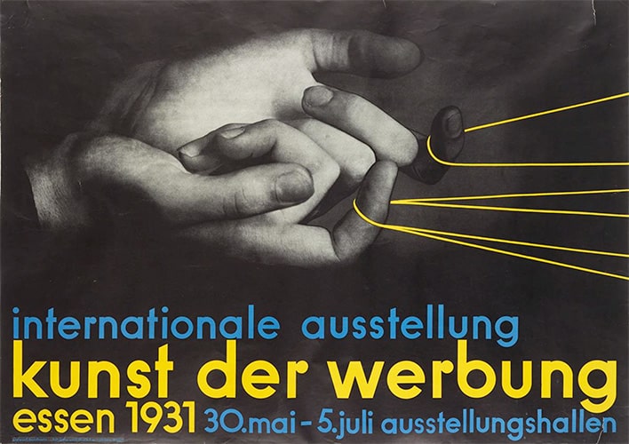
Internationale Ausstellung Kunst der werbung 1931
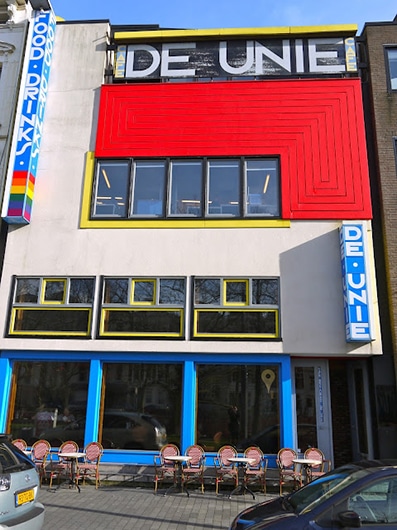
Die Unie Café in Rottedam, designed by J. J. P. Oud in 1925
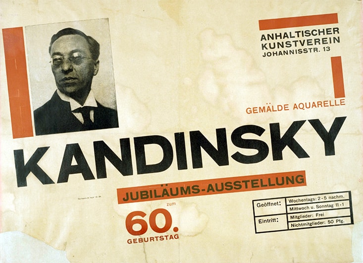
Herbert Bayer poster for Kandinsky zum 60. Geburtstag from 1926
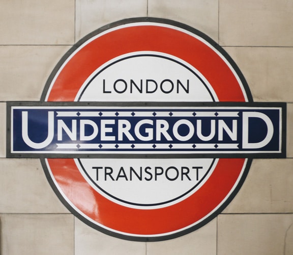
London Underground roundel by Edward Johnston.
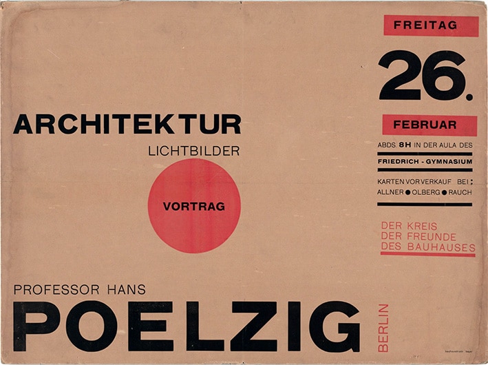
Herbert Bayer’s poster for Professor Hans Poelzig in 1926
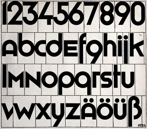
Max Burchartz Universal alphabet of 1924


Download trial font
The trial fonts are not for commercial use. By submitting this 'Download trial font' form, you are agreeing to receive marketing and communication emails from The Foundry Types. These are very occasional, and you can unsubscribe at any time. A download link to the trial fonts will be sent to your email address.