The Type of Two Cities: London and Amsterdam.
First in our series of blog posts by David Quay, aka ‘Type Tourist’ with his article for the ISTD, International Society of Typographic Designers journal – TG71. Here, David compares and contrasts the lettering found in two cities that are close to his heart: London and Amsterdam.
With so many cities invaded by global brands, the visual landscapes of even far-flung places have started to look and feel the same. But is there still evidence of individuality to be found in the fabric of the urban environment?
David Quay (aka the Type Tourist) compares and contrasts the lettering found in two cities which are close to his heart: London and Amsterdam.
I am fascinated by urban typography – discovered in the architecture, remains of façades, and the fabric of buildings. Exploring cities from a lettering perspective allows us to view them in quite a different way – both the history and culture of a city are conveyed through its typography.
Take two cities that I know well from varying perspectives – Amsterdam and London. The first is a city built on global trade, the second is one that had a global empire. How unique and revealing is their individual typographic topography?
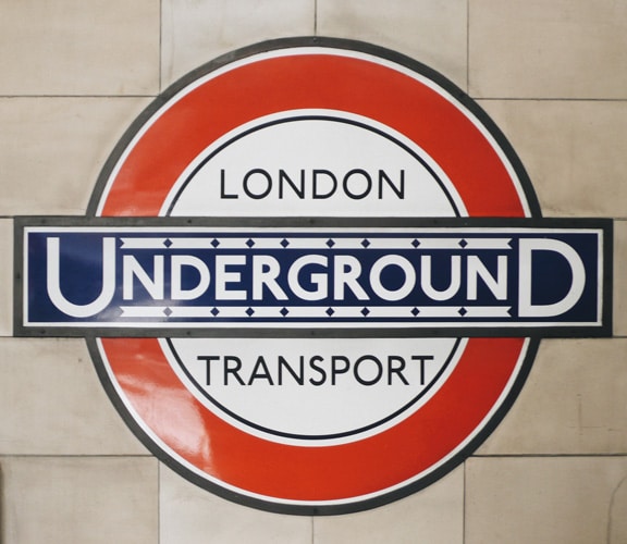
London Underground roundel by Edward Johnston.
Arriving in London I dive into the Underground and on seeing Edward Johnston’s familiar Underground roundel I feel immediately at home. In fact, the whole journey I am happy being surrounded by one of the earliest examples of a cohesive branding for a city – Johnston’s Underground alphabet that first appeared in 1916. I leave the Underground and jump onto one of the new beautiful Thomas Heatherwick buses. I am again transported along by Johnston’s condensed version of his underground alphabet. It seems that Johnston Sans is becoming the DNA typeface of London. I notice that it’s also now being used above ground on the superb pedestrian signage system designed by Applied Wayfinding which helps you find your way around the metropolis.
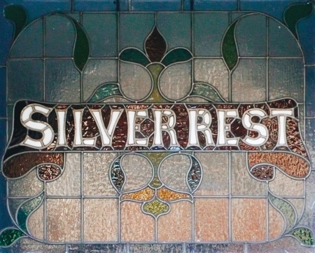
‘Silver Rest’, Edwardian stained glass house name.
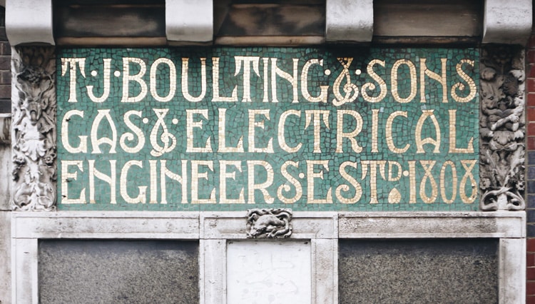
I finally arrived at my destination in one of the Edwardian suburbs where the burgeoning middle-class built their terraced villas by the thousands. Many still have their names above the door in stained glass and the street names are set in Albertus, which was designed by Berthold Wolpe between 1932–1940. Here we have a quintessential English typographic landscape. There are many other prime individual examples of very English lettering which can still be found in central London. Some of my favourites are James Smith & Sons, the umbrella shop built-in 1857, which is still at 53 New Oxford Street and covered with Victorian lettering. At 59 Riding House Street is T J Boulting & Sons, a Scottish Arts & Crafts influenced building with its beautiful mosaic lettering panels, (see the main image).
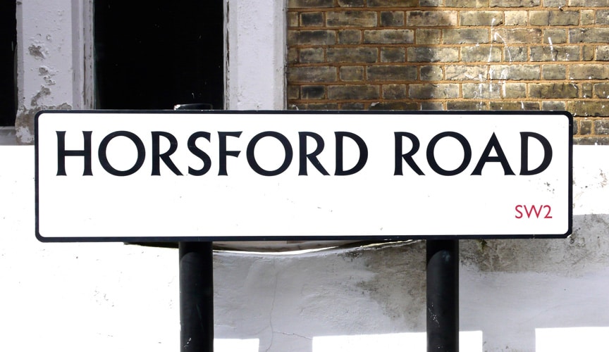
Street name set in Berthold Wolpe’s Albertus.
Further out, there is Fulham Public Baths & Wash-Houses in North End Road which was built in 1902. The lettering above the door of King Edward’s Mansions on the Fulham Road is a great example, and typical of the many mansions and houses of this period which you can find all over London.
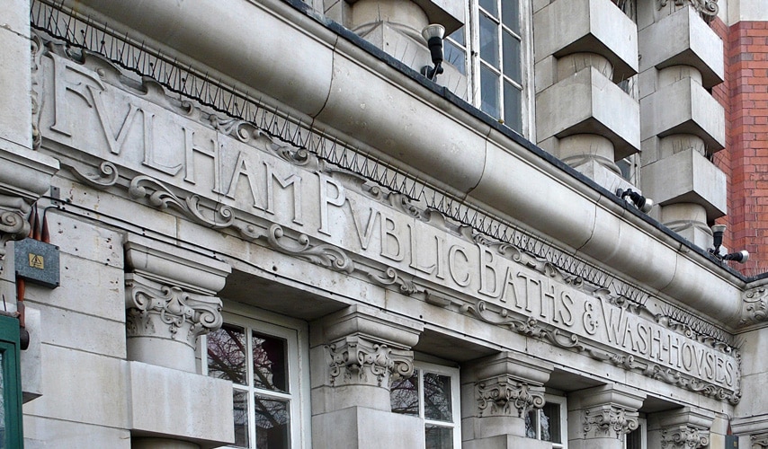
Fulham Public Baths & Wash-Houses.
At the end of the day, I wander down to The Black Friar public house near Blackfriars Station, which was remodeled in 1905 by architect Frederick Fuller-Clark with sculptors Frederick T Callcott and Henry Poole. There’s a beautiful Arts & Crafts interior, but it’s the outside with its copper panels of lettering at window level and mosaic lettering above that is really wonderful. It’s shocking to think that this fantastic example would have been torn down in the 1960s had Sir John Betjeman not intervened. There are many more pubs with distinctive and very English exteriors of glazed tiles – these were often made by Dalton of Lambeth.
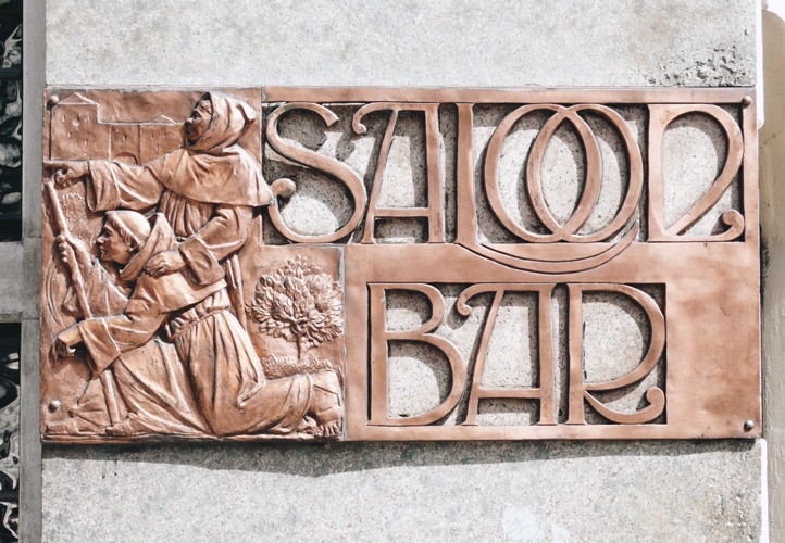
The Black Friar public house ‘Saloon Bar’ sign.
Contrast London – a pulsating and dynamic city with a population of over eight million that is continually being torn down and rebuilt – with Amsterdam and its population of around 850,000. Built on wooden piles that go 30 meters down through a deep level of sand to reach the firm layer of clay below, high-rise structures are impossible to build. Amsterdam’s stringent building regulations have kept most of the historical heart of the city and its 19th-century suburbs and 1930s’ Amsterdamse School social housing development virtually intact. Large global brands find it difficult to find enough space to justify having a presence here. Having a city that has changed very little architecturally means that much original lettering can still be seen. The main difference from a typographic perspective is that Amsterdam does not have a major typeface (like Johnston) binding it together. However, it does have some very unique letterforms that give the city a distinctive typographic signature.
‘Amsterdamse School’ house numbers.
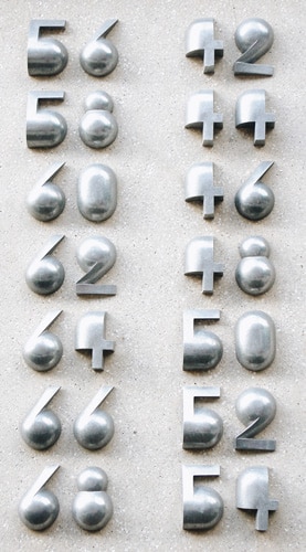
‘Amsterdamse School’ house numbers.
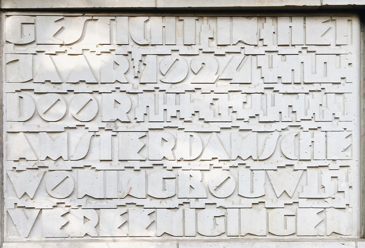
Commemorative plaque in ‘Amsterdamse School’ style.
The ‘Amsterdamse School’ is a style of architecture that was popular from 1910 through until about 1930. Its decoration, furniture as well as its lettering are highly recognisable. Much of the large areas of social housing in the south remain unaltered, and many of the house names and street numbers are in keeping with the distinctive buildings. The monument celebrating the building of the area is in typical geometric Amsterdamse School style.
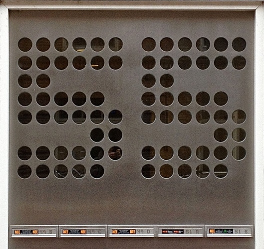
The ‘Amsterdamse Brugletter’.
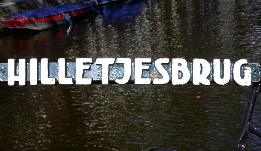
The ‘Amsterdamse Brugletter’ is probably the most famous and recognisable alphabet that the Amsterdam School produced and is one whose maker has remained semi-anonymous. The Amsterdam Bridge letter was made by the Public Works Department. Amsterdam boasts around 1700 bridges and sluices, and around 1930 all bridges were given a name, and identical cast iron nameplates were attached to them. I am ninety-nine percent certain that Anton Kurvers designed the letters. Not only did he work at the Public Works Department at that time, but he also designed book covers using letters that are similar to the Brugletter. There are also several bridges that are built in the Amsterdamse School style which are made of granite and their names are carved in relief.
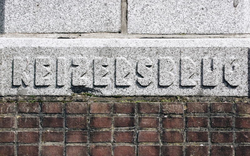
The ‘Amsterdamse Brugletter’
Another very obvious part of Amsterdam’s typographic house style is the old traditional ‘bruin’ cafés. Many have their name painted in ‘Amsterdamse Krulletter’ (Amsterdam’s Curly Letter) style on their windows. Leo Beukeboo was a prolific sign painter who was responsible for many of the best ‘Krulletter’ that can still be found in Amsterdam today. He was active between 1965–2003 when he was hired by the Heineken Brewery to be its in-house letter painter.
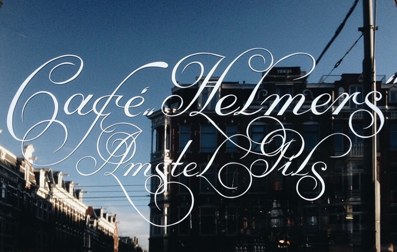
Leo Beukeboom’s café ‘Amsterdamse Krulletter’.
The Nederlands has a rich history of tile making, and between 1890 and 1940 there were dozens of factories that produced these tiles. Many schools and institutions in Amsterdam have tile lettering tableaus above their entrances; these are often by Rozenberg (who was a tile maker from Den Haag) or Distel, who was from Amsterdam. As Art Nouveau waned, a more geometric style evolved that was a precursor to De Stijl – a uniquely Dutch phenomenon that began in 1917. Cities are constantly in flux – London more so than Amsterdam – and as some historical gems disappear forever, more are revealed from behind plastic and neon façades, and these are being repaired or repainted.
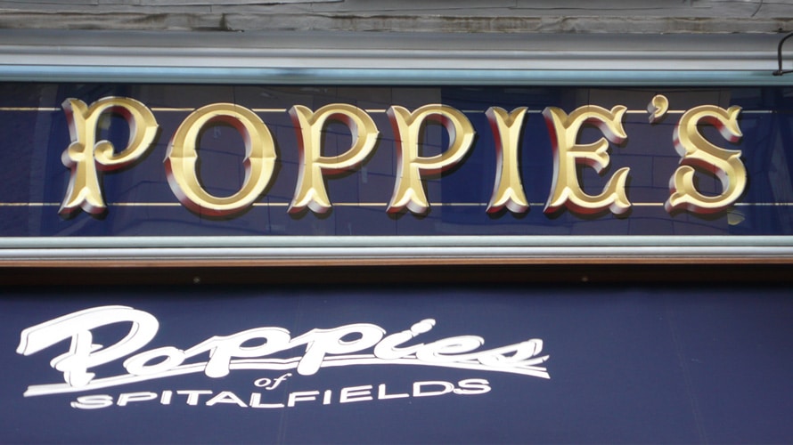
Poppie’s modern pastiche of Victorian facia lettering.
The appetite for authentic-looking lettering means that some are even faked. An interesting example of the latter is the beautiful ‘new’ Victorian signage for Poppie’s Fish and Chips restaurant – a great example of England recreating its glorious past. It could be suggested that this verges on the pastiche, but the lettering is well-crafted and works perfectly in context. Much in Amsterdam still remains, although the old traditional ‘bruin’ cafés are slowly disappearing along with their ‘Amsterdamse Krulletters’ due to mass tourism and gentrification. The Public Works Department still commissions designers to work on buildings and projects, and designer Janno Hahn has been busy giving names to new bridges and cycling underpasses with his letters based on Amsterdam’s well known Amsterdamse School tradition.
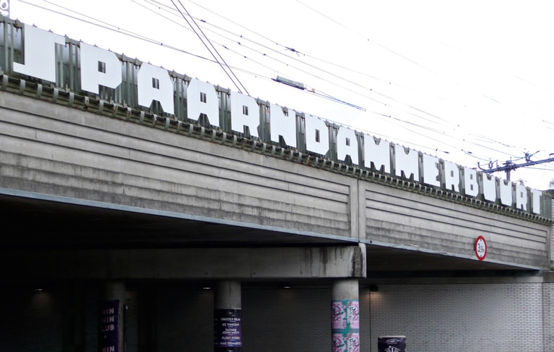
Janno Hahn’s recent lettering for the public works committee.
In the last few years, both cities have seen the rise of young signwriters who are heavily influenced by the traditional craft but build on this to make new, more individual styles of hand lettering. This fits perfectly with the independent shops and cafés which are springing up in both cities, catering to a design-savvy crowd who don’t want to buy their coffee at Starbucks. It’s also refreshing to see the renewed interest in preserving historical examples of lettering in the urban environment, and the acknowledgment that this forms an important part of both the fabric and character of our great cities.
With special thanks to David Coates from the ISTD – International Society of Typographic Designers. You can buy Typographic 71 here.
Related articles