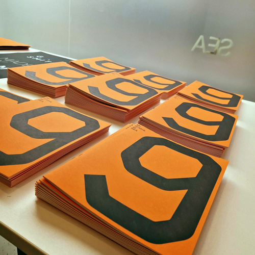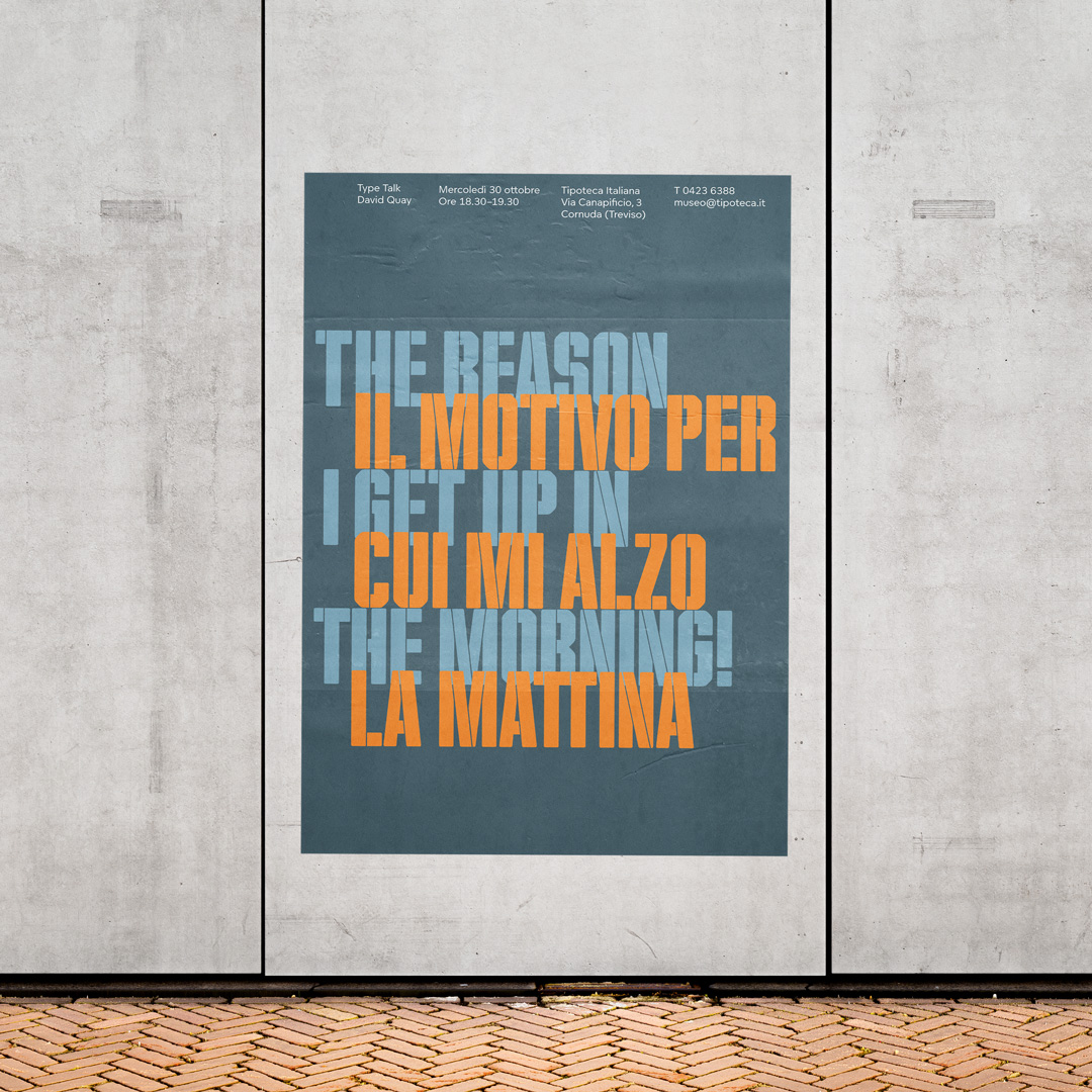
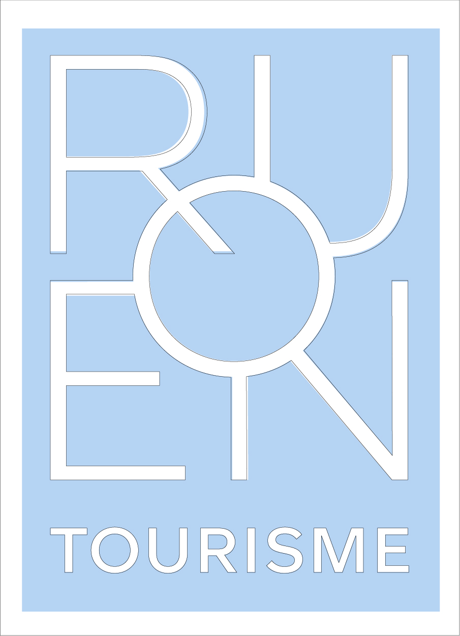
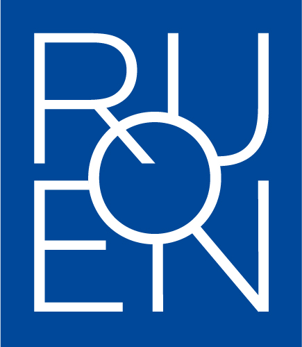
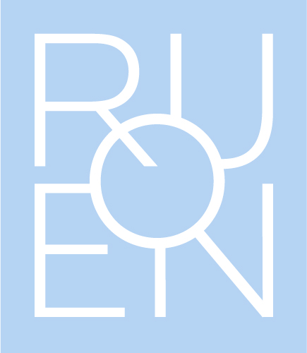
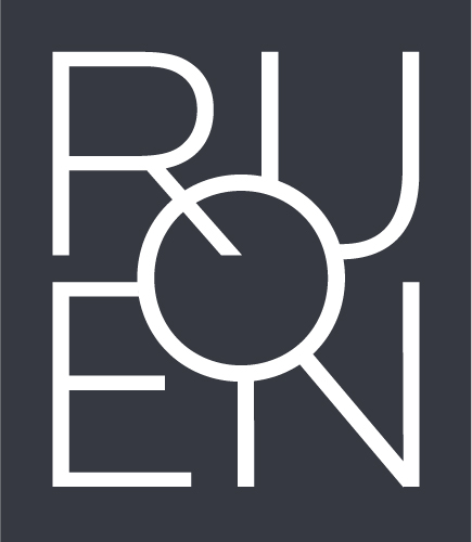
The new identity for Rouen Tourisme in collaboration with Studio Apeloig.

In the hazy Summer of 2022, we were approached by the World leading French designer Philippe Apeloig with an exciting collaboration. In the lead-up to the Summer, Studio Apeloig had been developing a sophisticated new brand identity for Rouen Tourisme, in the Normandy city of Rouen, home to the Notre-Dame Cathedral.
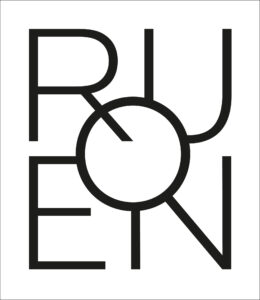
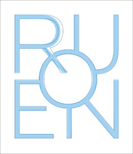
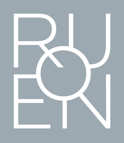
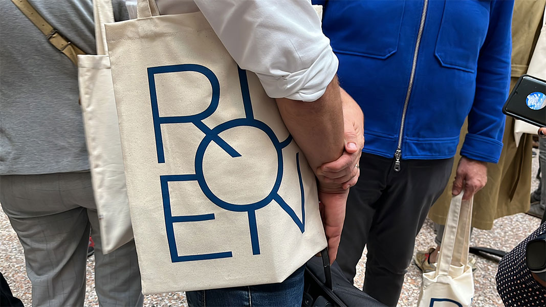
Taking our new geometric sans typeface Foundry Unie as a basis, Philippe created an elegant, pure, and simple logo by constructing the five letters of the name, ‘ROUEN’ into an interlocking configuration. It was clear to Philippe that the letterforms layered in this way created an awkward visual conundrum. He decided to commission us to assist him with refining and crafting the Rouen Tourisme logo into a more harmonious mark, and for Foundry Unie to become the primary typeface throughout the new identity.
Animation sequence courtesy of Studio Apeloig
Creating visual harmony in logos or word marks can be a tricky task. Balancing positive and negative shapes, stroke weights, and adhering to an already formulated geometry creates its own dilemmas. To balance the ‘ROUEN’ mark, we first needed to establish the central focal point, in this case, the ‘O’, which was redrawn to be optically circular.
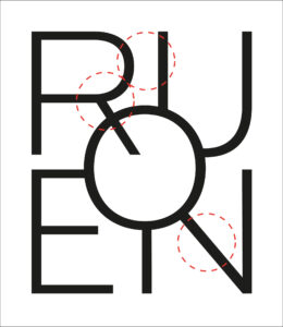
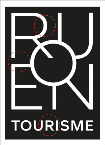
R – The ‘R’ bowl is a touch too wide and close to the ‘U’. The diagonal leg angle is too steep and needs to appear visually in line with the ‘N’ coming through the ‘O’.
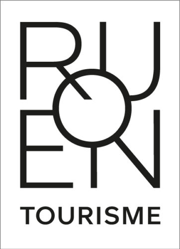
O – The ‘O’ needed to be more circular, with less thick and thin contrast from the original. The final ‘O’ is wider and mono-linear in appearance.
U – The ‘U’ has been made wider to counterbalance the wider ‘O’ and the horizontal stroke made slightly heavier.
E – The middle ‘E’ bar appeared too close to the ‘O’, to allow us to widen the ‘E’ we lowered the middle bar fractionally. The horizontal weights were adjusted to appear monoline.
N – The ‘N’ diagonal is fractionally heavy and should be monoline to the vertical strokes. The vertical stroke from the ‘O’ was marginally too light.
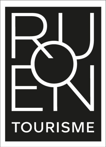
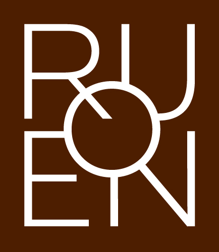
One stipulation of Apeloig’s brief was to also include a negative version with accompanying small 3 mm sized versions. With Philippe approving the positive version, the next task was to tackle the negative logo. A key factor in crafting the reversed-out version is the thickness of the stroke, this must be thinner or lighter than the positive version, remaining unchanged would indicate a ‘glowing’ effect and appear too heavy.
Also, the spacing of letterforms and shapes needed to be opened up, as they appear far too close across the elements. The constant analysis between the two versions shows that small, careful adjustments are crucial to making both versions appear visually equal and balanced.
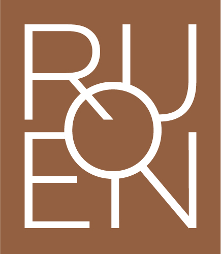
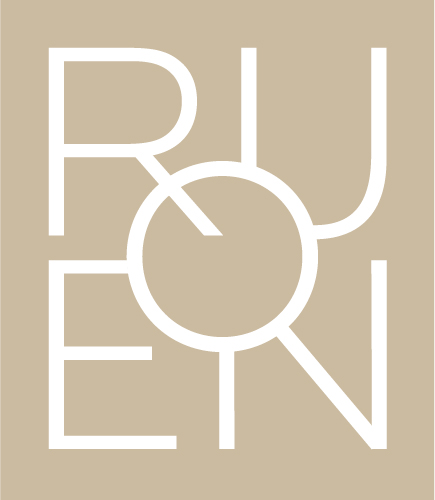
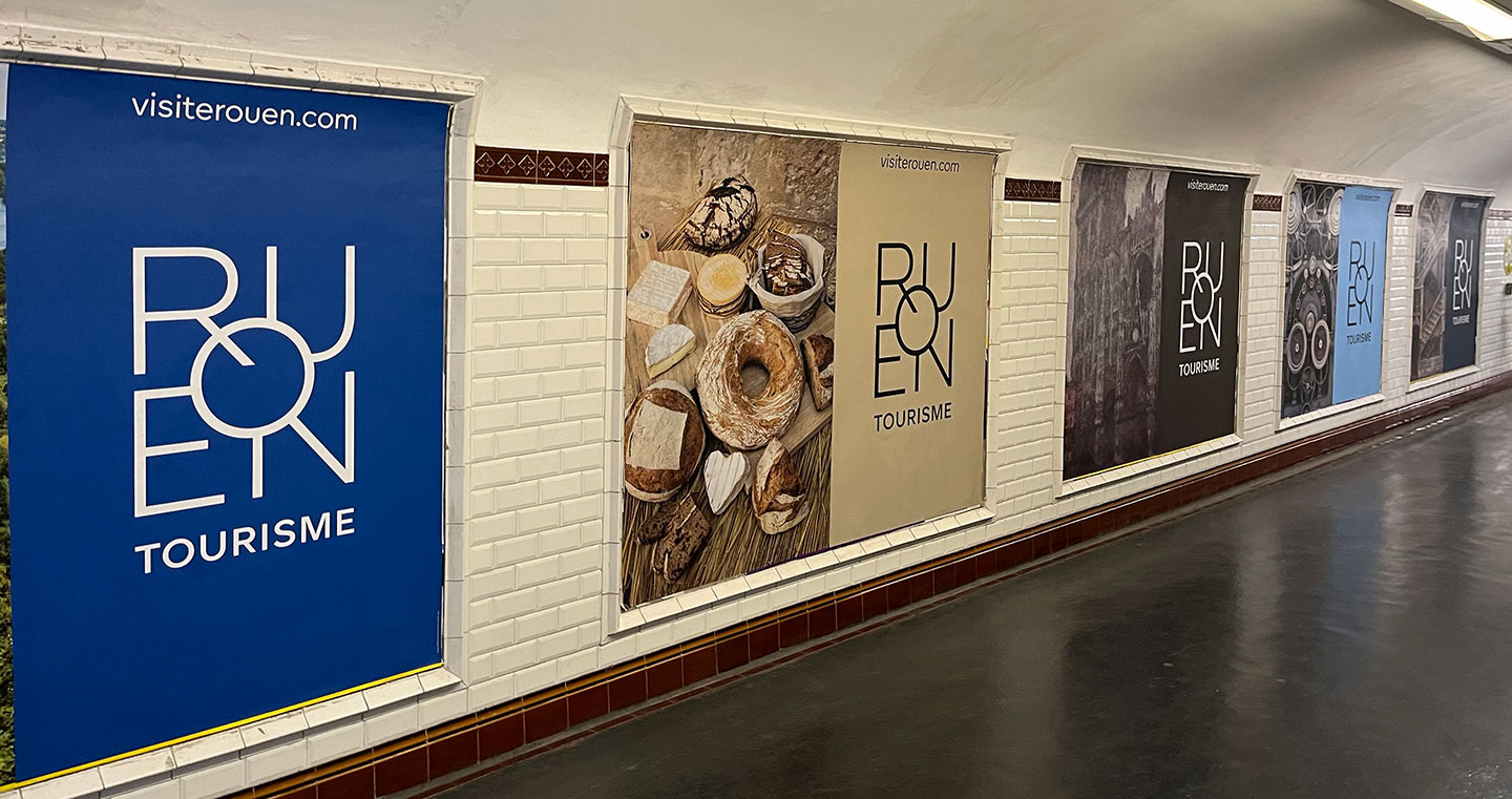
The contrasting coloured logo variations represent the exceptional heritages of the region – Art, History, Nature, Industry, and Gastronomy expressing the tonal variety of Rouen the City.
The Rouen Tourisme brand colours
Philippe Apeloig, Studio Apeloig
I look for the perfect proportions, a good balance between the positive and negative shapes, and counter-shapes. Therefore, I approached The Foundry Types to assist us by crafting and refining the Rouen Tourisme logo. The aim was to achieve excellence in letterform proportions, shapes, and spaces, and I know The Foundry Types’ team thrives on the small, fine details with an acute eye and expert attention to detail. The final and crucial touches enhanced the purity of the Rouen logo composition to reach its optimum aesthetic, whilst delivering exceptional quality.
Stuart de Rozario, The Foundry Types
We were thrilled and proud when Philippe Apeloig approached us to refine the detailed adjustments and proportions of his design for the Rouen Tourisme logo. With Apeloig’s distinctive, creative, and playful style, the design for the logo reflected a sympathetic, subtle, and modernist tone for the Normandy city.
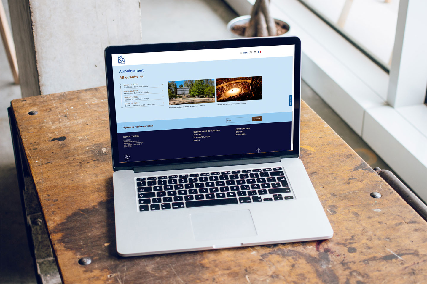
Using Foundry Unie as a starting point for the logo allowed us to expand on the principles from which the font was designed – a calm, understated aesthetic. Pure, simplistic lines and well-crafted shapes echo Apeloig’s sophisticated vision for the Rouen Tourisme brand ethos. Visit Rouen and see its unique, bespoke brand identity, visible throughout the city.
If you would like to licence or commission us to create a bespoke version of Foundry Unie or any other of our fonts, please click the link or contact us – we’re only too happy to help.
Our special thanks go to Philippe Apeloig at Studio Apeloig for his kind permission to showcase the animations.
Related articles