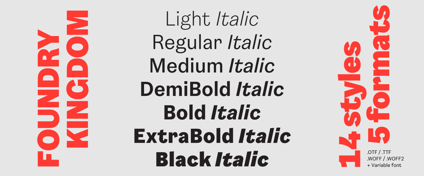
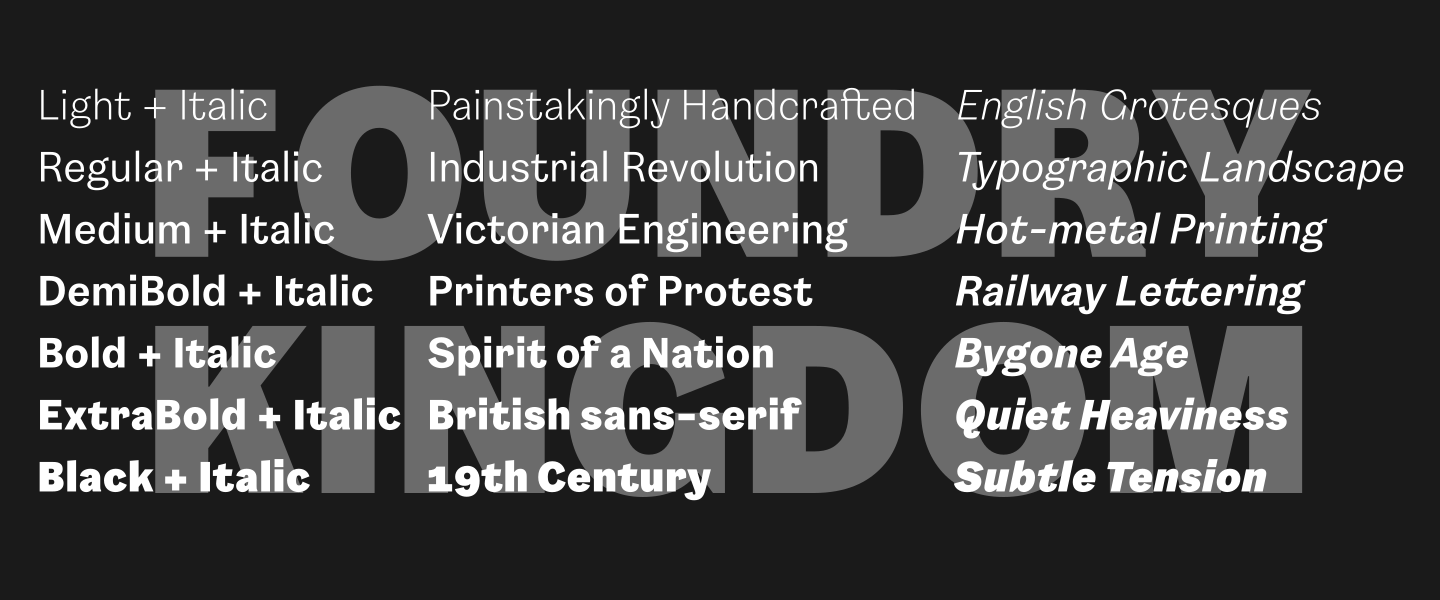
14 styles
Tester
Weights







Glyphs
Languages
Abenaki, Afaan Oromo, Afar, Afrikaans, Albanian, Alsatian, Amis, Anuta, Aragonese, Aranese, Aromanian, Arrernte, Arvanitic, Asturian, Atayal, Aymara, Bashkir, Basque, Belarusian, Bemba, Bikol, Bislama, Bosnian, Breton, Bulgarian Romanization, Cape Verdean, Catalan, Cebuano, Chamorro, Chavacano, Chichewa, Chickasaw, Cimbrian, Cofan, Corsican, Creek, Crimean Tatar, Croatian, Czech, Danish, Dawan, Delaware, Dholuo, Drehu, Dutch, English, Esperanto, Estonian, Faroese, Fijian, Filipino, Finnish, Folkspraak, French, Frisian, Friulian, Gagauz, Galician, Ganda, Genoese, German, Gikuyu, Gooniyandi, Greenlandic, Greenlandic Old Orthography, Guadeloupean, Gwichin, Haitian Creole, Han, Hawaiian, Hiligaynon, Hopi, Hotcak, Hungarian, Icelandic, Ido, Ilocano, Indonesian, Interglossa, Interlingua, Irish, Istroromanian, Italian, Jamaican, Javanese, Jerriais, Kala Lagaw Ya, Kapampangan, Kaqchikel, Karakalpak, Karelian, Kashubian, Kikongo, Kinyarwanda, Kiribati, Kirundi, Klingon, Kurdish, Ladin, Latin, Latino Sine, Latvian, Lithuanian, Lojban, Lombard, Low Saxon, Luxembourgish, Maasai, Makhuwa, Malay, Maltese, Manx, Maori, Marquesan, Meglenoromanian, Meriam Mir, Mirandese, Mohawk, Moldovan, Montagnais, Montenegrin, Murrinhpatha, Nagamese Creole, Ndebele, Neapolitan, Ngiyambaa, Niuean, Noongar, Norwegian, Novial, Occidental, Occitan, Oshiwambo, Ossetian, Palauan, Papiamento, Piedmontese, Polish, Portuguese, Potawatomi, Qeqchi, Quechua, Rarotongan, Romanian, Romansh, Rotokas, Sami Inari, Sami Lule, Sami Northern, Sami Southern, Samoan, Sango, Saramaccan, Sardinian, Scottish Gaelic, Serbian, Seri, Seychellois, Shawnee, Shona, Sicilian, Silesian, Slovak, Slovenian, Slovio, Somali, Sorbian Lower, Sorbian Upper, Sotho Northern, Sotho Southern, Spanish, Sranan, Sundanese, Swahili, Swazi, Swedish, Tagalog, Tahitian, Tetum, Tok Pisin, Tokelauan, Tongan, Tshiluba, Tsonga, Tswana, Tumbuka, Turkish, Turkmen, Tuvaluan, Tzotzil, Ukrainian, Uzbek, Venetian, Vepsian, Volapuk, Voro, Wallisian, Walloon, Waraywaray, Warlpiri, Wayuu, Welsh, Wikmungkan, Wiradjuri, Wolof, Xavante, Xhosa, Yapese, Yindjibarndi, Zapotec, Zulu, Zuni.
About Foundry Kingdom
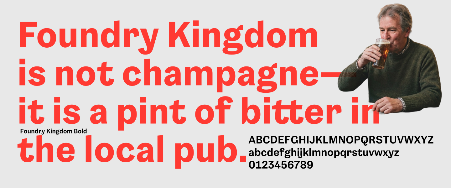
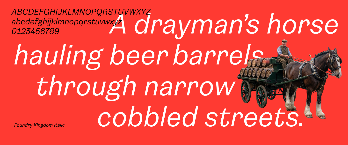
Foundry Kingdom is not champagne—it is a pint of bitter in the local pub. It is not the King’s horse at Ascot, but the drayman’s horse hauling beer barrels through narrow streets. It is not spectacle or ceremony, but industrial labour: the quiet dignity of work.
Rooted in the early English grotesques of the 19th century, Foundry Kingdom carries an industrial echo of cast metal, railway lettering, and newspaper type battered by use. But it avoids nostalgia for its own sake. Instead, it feels contemporary in its restraint, as though those historical references have been absorbed and reinterpreted rather than imitated. It carries the spirit of a nation shaped not by rulers, but by its people—those who built, dug, carried and endured.
Grotesques emerged from the smog of the early English Industrial Revolution. The first sans-serif to appear in a type specimen book was William Caslon IV’s Two Lines English Egyptian of 1816, widely regarded as the first commercially available sans-serif.
Thorowgood’s condensed sans-serifs, especially the Seven-line Grotesque of 1834, were among the earliest to include lowercase and helped establish the model that later influenced German Grotesk type. British sans-serif display types spread quickly into Central Europe; by the mid-1830s, they appeared in German-speaking regions and in Prague specimens of 1835. Eduard Haenel was among the early figures associated with introducing sans-serif printing types in Germany.
By the 1830s, lowercase grotesques were in use in Germany and soon after in the U.S, though not in Britain until the 1870s. By the end of the 19th century, every foundry had a full range of grotesques, from light to ultra-bold, condensed to expanded. The range was one of their great strengths.
From there, the German and English traditions diverged. German grotesks developed toward neutrality, leading to Akzidenz-Grotesk and later Helvetica. English grotesques, by contrast, matured through decades of use while retaining their distinctive character.
A defining milestone came with Akzidenz-Grotesk, released by H. Berthold AG in 1898. Emerging from the broader grotesque tradition, it established a model of clarity and neutrality that would influence many later designs, including Helvetica. English sans-serifs followed their own path, rooted in the irregular, expressive forms of their early origins. Together, both traditions helped shape the typographic landscape we know today.
Foundry Kingdom holds firmly to the English line. It is not designed for palaces. It is a working typeface: for small ads and bold headlines, for newspapers that spoke during strikes and unrest, for voices that refused to be quiet. It is for the printers of protest, the chroniclers of injustice and the everyday readers who made meaning from ink on paper.
It is not refined or decorative. It is direct, grounded, purposeful and powerful—painstakingly handcrafted, with a sense of weight and utility, as if made to endure repetition, pressure and time.
There is a solidity to it. The strokes carry a quiet heaviness—deliberate, not clumsy—giving the letters a physical presence on the page. They suggest ink pressed firmly into paper and the force of hot-metal printing. These are forms built to be read quickly and clearly under less-than-ideal conditions.
Its proportions are functional: open enough to remain legible at small sizes, yet striking at larger ones. There is a subtle tension between human irregularity and desired perfection—edges not overly polished, shapes that resist sterility. This is not neutrality. Foundry Kingdom carries tone and weight.
In headlines, it asserts. In text, it works. It does not ask for attention through flourish, but earns it through clarity and presence. It feels made for communication under pressure: for statements, notices and voices that need to be heard without embellishment. It has the cadence of something spoken plainly, without performance.
It is not elegant in the traditional sense. It is dignified.
Foundry Kingdom pairs a large x-height with concise spacing to support readability, especially at smaller sizes. Open terminals and generally narrow letterforms create a compact internal structure without sacrificing legibility. Distinctive features include the bold terminals of the a, c, g, j, r, s, t, and y. The overarching shaping of the f, j, t and y, details that express its contemporary homage to a bygone age.
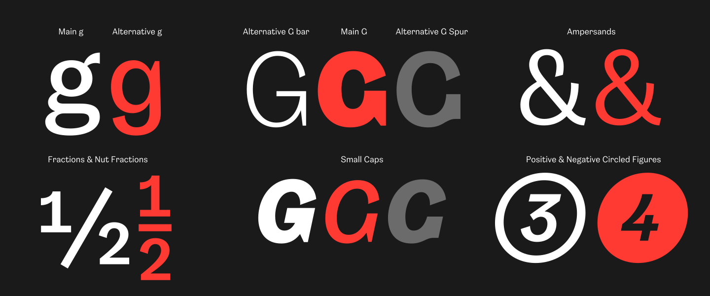
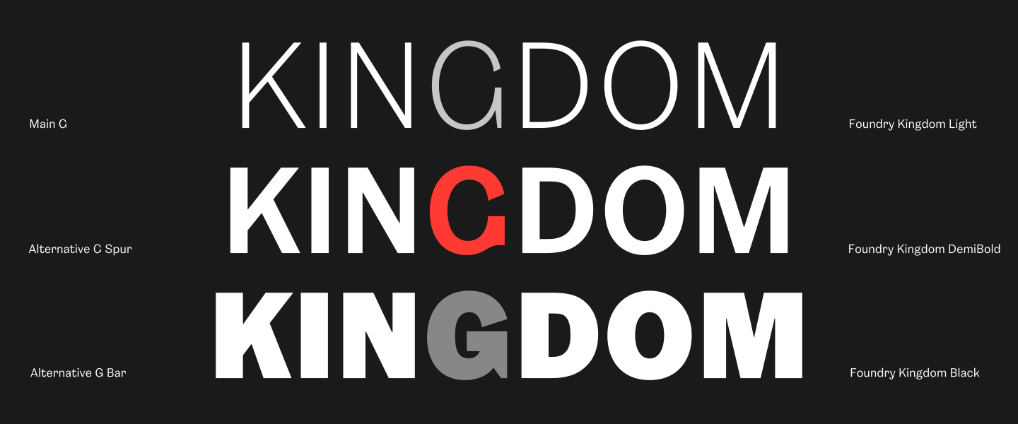
Legibility features include a distinctive Q tail, an extended K arm in the capitals and two alternative Gs. The lowercase includes a two-storey a, a double-storey g, a wide t bar and a curved y descender.
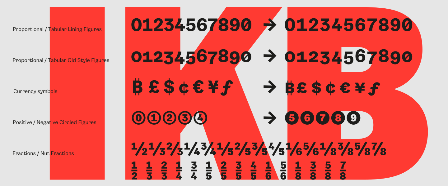
Foundry Kingdom also includes alternate figures and punctuation, such as a slashed zero, a figure one with a baseline bar in the tabular set, and both proportional and tabular figures. Additional features include circled positive and negative figures, alternative nut fractions, a full range of small caps and a choice of open or looped ampersand.
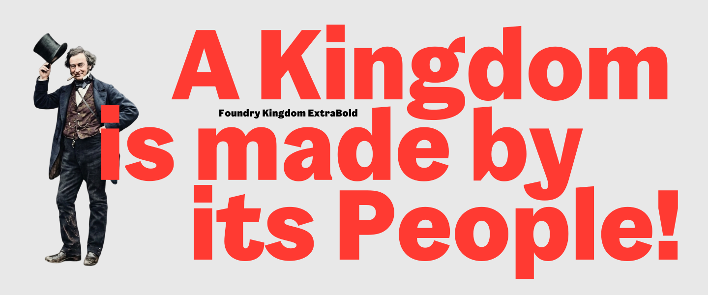
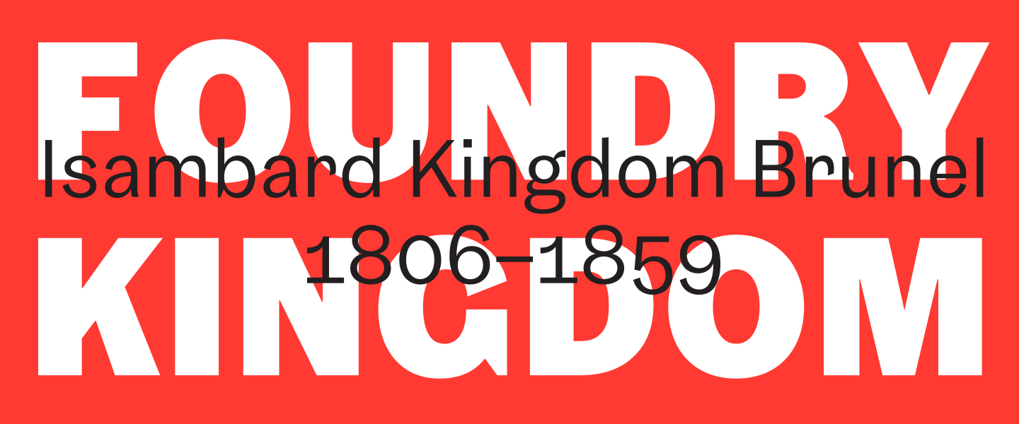
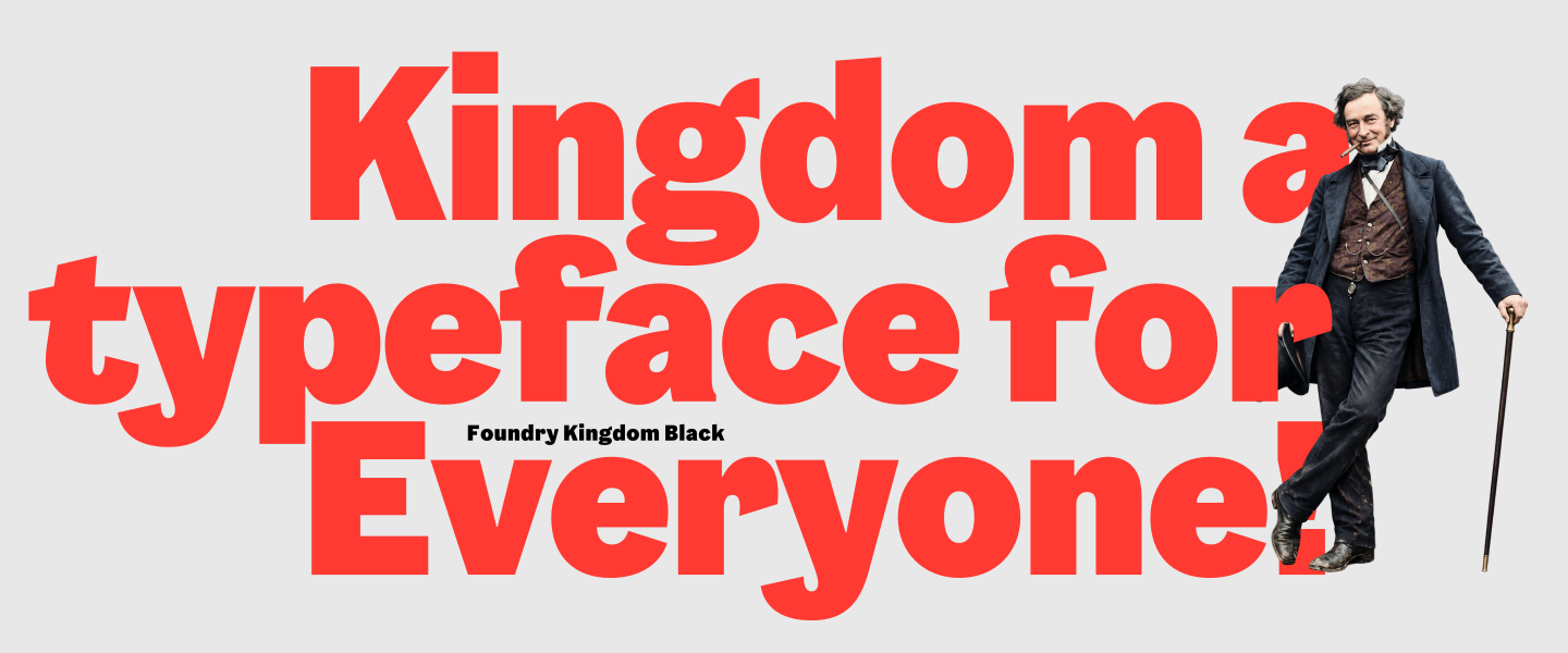
Foundry Kingdom is a homage to the greatest of all Victorian engineers, Isambard Kingdom Brunel.
A special ‘Thank you’ to Jim Sutherland and Ethan Brown of Studio Sutherl& and Nick Asbury of Asbury and Asbury for their kind support and contribution, for the collaboration on the newspaper specimen ‘Foundry Kingdom – A KINGDOM OF PANGRAMS’.
Download trial font
The trial fonts are not for commercial use. By submitting this 'Download trial font' form, you are agreeing to receive marketing and communication emails from The Foundry Types. These are very occasional, and you can unsubscribe at any time. A download link to the trial fonts will be sent to your email address.